Sunday, May 30, 2010

Birthday Bliss

I found time for a little stamping this morning - I wanted to do a couple challenges. The sketch is Jen del Muro's Sketch for You to Try, and the colors come from the ColourQ challenge. This is my kind of color challenge - six colors! I didn't realize until I was all done that I used brocade blue instead of ballet blue... oops! Don't shoot me, LOL!

For the big circle I picked the cupcake from Party Hearty. The frosting and candle are popped up on the (of course) chocolate cupcake. I used Nestabilities for the white and kraft circles. The DPs are a mix of current and retired pattern prints, along with a strip from Island Oasis. The sentiment from Birthday Bliss has the center popped up, with a layer from the Lots of Tags dies. Finally I added my clip with a knot of ribbon and a button attached with glue dots. What do you think? It didn't come out quite as masculine as I was envisioning, but I'm OK with that!

Saturday, May 29, 2010

Black and White Wedding


It's the last week of May challenges over at Our Creative Corner - and it's a great end to the month. Our hostess, Loretta Lock, is challenging us to create a black and white card with lots of texture, and there's a bonus element: use text as the focal point. I'm not sure what I think of this card - I think it was a good idea but maybe it didn't turn out quite like I envisioned... oh well!

The sketch comes from Jen del Muro. It was the perfect sketch since I had decided to take this stamp from Everything Nice and split up the two sections of text, then repeat "forever and always" three times. To get some texture I embossed with both black and white EP. The designer paper on the left comes from the retired pack Day and Night, and on the right I used the square lattice embossing folder. I embellished the card with Scribble Swirls cut from textured whisper white cardstock, flowers punched with the Itty Bitty flower punch and topped with Pretties Kit pearls, and black grosgrain and white satin ribbons.

Be sure to stop by the other OCC team members' blogs and see what they came up with - their creations are always amazing! Then be sure to play along since we love to see what you make each week. Have a great weekend!

Tuesday, May 25, 2010

I couldn't help myself

I got out my Copics for this card. It's been a long time, and I nearly forgot how fun they are to play with. I made this card for the first challenge in the SCS clean and simple design team tryouts. I don't know if I'll make it to the next round, but I had to try! This challenge called for using a person or character, and I discovered I'm sorely lacking in stamps in that department. So I went hunting for a digi image and found this one at Squigglefly. The colors came from the Making Memories embellishments I picked - another component of the challenge was to use a bold ribbon. I hope this is bold enough - it was tough for me!

The layout was inspired by the Mojo Monday challenge, but I didn't stick with the sketch in the end - the image was just too big! The colors worked well with bermuda bay and cameo coral, so I chose background papers in those colors. The coral comes from the Pink Flamingo papers, and the bermuda bay solid DP was embossed with a texture plate and sanded. I finished off with a Well Scripted sentiment. I have to say, I think it turned out pretty cute. And I may be tempted to get those Copics out again before too long...

Monday, May 24, 2010

Happiness is... summer!

I decided I wanted to play along with today's clean and simple challenge at SCS. The theme of the day is summer, so I brought out some bright colors and glittery flowers for my card. The flowers and "leaves" are two of the images in the hostess set Punched Posies. I made them sparkly with the help of heat and stick powder and Fine Supernova glitter. The striped paper is from the summer mini's Island Oasis collection. This print actually has a red stripe in it, which I didn't want, so I trimmed down the strips and put them onto old olive cardstock. Nice optical illusion, eh? I added a circle die-cut from the turquoise dot paper from the same pack, then a layer of olive cut with the Circle Scissors Plus. For the background I used so saffron DP, then I finished off with a Warm Words sentiment and just a bit of piercing, and two pumpkin pie Sherbet buttons tied with linen thread. Now I feel ready for summer, which I guess it's going to feel like around here tomorrow... bring it on!

Saturday, May 22, 2010

Gathering of Stampers

Tomorrow I'm cohosting a shoebox swap with my upline, Nola. My two main tasks for this were to prepare two card projects and make the party favors. I'll start with the cards... they are supposed to be springy and simple so I hope I satisfied both requirements!


My first card was a combination CASE from the mini catalog (bright colors with the hostess stamp set Punched Posies) and Andrea Walford. I used real red, pumpkin pie and tempting turquoise for my stamped and punched flowers, and old olive textured cardstock for the leaves (done with the extra large bird punch). Each flower got a black vintage brad in the center. The background is retired turquoise DP stamped with a sentiment from On Your Birthday, plus more cardstock layers. I finished off with a strip of black satin ribbon. It's official - I now have this ribbon in every color. Love it!


My next card was inspired by a photo I saw browsing online stores - I didn't seem to save the link! It was a set of cards with layered butterflies in bright colors. I thought it would be pretty easy to make something similar with the Big Shot dies. I used bermuda bay, regal rose, so saffron and rich razzleberry. The sentiment is from Trendy Trees.

I decided to make a box for the party favor. It's pretty much a CASE of this one by Angie Juda, with a die-cut and embossed butterfly on the front. Inside I used a box rather than a bag, based on the box that's inside the purse shown here
Attached to each box is a luggage tag using more of the Sweet Pea papers and the bird punch. I thought these turned out pretty darn cute, if I do say so myself... good thing I get to keep one for myself! And if you are dying to know what's inside the treat bags, it's white chocolate party mix. This stuff is really good, and really addictive... don't say I didn't warn you!

Watercolor Birthday

Welcome to another Saturday and another challenge with Our Creative Corner. This week our hostess, Loretta Lock, gave us a fun sketch challenge. I kept it pretty simple this time around. I'm featuring the stamp set Watercolor Trio from the summer mini catalog. The main image was colored with melon mambo, not quite navy and certainly celery markers, then stamped on whisper white and cut out with Nestabilities. Behind that I put a certainly celery panel that was stamped generation style with another image from the stamp set. The bottom paper panel comes from Razzleberry Lemonade, with a sentiment from Sincere Salutations. To embellish I added a couple not quite navy buttons that I'd tied with embroidery floss and a simple white taffeta ribbon, and the final touch was to pierce the scallops on the not quite navy oval.

I hope you'll go check out the sketch and the rest of the design team samples at the OCC blog - we always look forward to seeing what you create!

Friday, May 21, 2010

It's no Monet, but...

I think I like it! I needed a technique card for club tonight and came across the technique called impressionistic stamping on Julie Davison's blog. The basic idea is you stamp on wet paper, let it dry, then stamp again over the first image. It took me some practice to get a look I was happy with, but it's a cool technique.

I already had the stamp set Watercolor Trio (from the summer mini) out, and since Julie had used it on her cards and I liked how it turned out, I decided to follow suit. Otherwise this is my own creation - I had been trying to use a sketch I'd seen posted but it just didn't work out so I went off on my own. I actually do that sometimes, LOL!

For the flower panel I experimented with a few different things. This is what I felt worked best: First I inked up the stamp with melon mambo and old olive markers. Then I spritzed watercolor paper with water just a couple of times and spread the water around with a dry brush. (You could also use an Aqua Painter.) I stamped immediately on the wet paper and let it dry, then stamped the image over top. Despite this being a clear-mount stamp, I still used the Stamp-a-Ma-Jig because to me it looked best when the image was placed exactly where I wanted it. How much water you spray on the paper is a personal choice - I tried between one and four squirts. The more water you use, the more your image will spread. I liked this version because you could still see some of the detail of the image from the first impression - with more water the image was really blurred and I preferred it this way.

For the rest of the card, I used a couple different products: the Very Vintage wheel (soft suede ink on an old olive card base) and the vanilla Smooch Spritz. I stamped a panel of soft suede cardstock with the En Francais background (stamped off once first) then sprayed the Smooch on until it was covered. I finished the layout with a panel of melon mambo designer paper, a strip of 5/8" old olive grosgrain ribbon covered with soft suede, and a sentiment from the same stamp set, using the Matchbox and Lots of Tags dies.

I'm off to keep working on projects for my busy stamping weekend. I will be back tomorrow with my OCC card and I also hope to show you some other stuff I've been working on, if I have time to post - stay tuned!

Thursday, May 20, 2010

Divine Diva Inspiration Challenge #28


For this week's challenge we have this fun photo I found at Macy's. Aren't these fun colors? I just realized that we've had butterflies in the challenge for two weeks in a row, but I guess they are popular right now so I hope no one minds!
I strayed a little farther from the inspiration photo than I intended, but it's all part of the process, right? For my colors I pulled out rich razzleberry, melon mambo, old olive, and whisper white. I used Jen del Muro's Sketch for You to Try (although I cheated a little on the strip that was supposed to go all the way across - this just worked better on my card).

Looking at the purple flowers on the makeup case, I was inspired to pull out my Live Your Dream stamp set. I will probably never part with these stamps - I just love this flower image so much. I colored it with markers and cut it out with Nestabilities. The stamp set even has a tiny butterfly, so after sponging the edges with razzleberry ink, I added my little butterfly cutout. The background is the (retired) So Swirly wheel on a white card base, with DP from Cottage Wall and the melon mambo pack. I added a sentiment from Short & Sweet, punched with the modern label punch/Movers & Shapers, and a razzleberry bow with a Playground olive button tied with linen thread.

Be sure to check out the cards made by all the Divine Divas for this challenge!

Anne

Chris

Donna

Julie

Kerri

Hope you are inspired to come and play along. Just leave a comment here with a link to your card. We can't wait to see what you create! The keyword for uploading on online forums will be DDIC28. Have fun and look for the next challenge on June 3!

Tuesday, May 18, 2010

It's that time again


Club time! With the last weekend of the month being a holiday weekend my club rolled around quickly this month. We're going to make this card for Father's Day card - it's a really simple card and you could even leave off the piercing to make it simpler yet. I got my original idea from this card - but I did the unthinkable and didn't make a note whose blog it came from! Sorry to whoever made this originally - please tell me if you know who should get the credit!

I like to teach my club members at least one new technique each month. This is one that's really fast and easy but it's such a wow. I used the plain sheet from the chocolate chip designer paper pack, ran it through the Big Shot with one of our texture plates, then sanded the design with a sanding block. It only works with this paper because it has a white core. From that panel I punched out a large star and placed a piece of so saffron textured cardstock behind it. The background panel is from the Sweet Pea paper (retired, I know... but my clubbies are OK with that) on a layer of so saffron, which I pierced all the way around. Then I stamped the sentiment from Teeny Tiny Wishes onto bashful blue, added a bit more piercing and a Latte button (threaded with a tiny strip of the same chocolate chip DP), and put it all together on a bashful blue card base.

I have a lot of cards to make this week, so if I get time to post them, you'll be seeing more of me in the next few days... it's a busy week so we'll see how it goes! Thanks for stopping by!

Saturday, May 15, 2010

Crazy for Circles

Well, I am back to my old blogging ways this week. I worked so hard last week that I really had a tough time getting anything done after that! But here's my card for this week's challenge at Our Creative Corner. Loretta has challenged us to make a masculine birthday card - always a good thing to practice since it can be tough! To maximize my mojo I used a couple other challenges with this card: the Color Throwdown and a sketch designed by Jen del Muro.

The day I made this card I got a shipment of brand-new stuff from Stampin' Up!, with a lot of it coming out of the new summer mini catalog. I decided I would see how many of my new goodies I would use on my card, and I managed to get several of them on there. With the lack of layering this is kind of an unusual card for me, but I like how it turned out. I hope it's masculine enough!

I started with a kraft card base that I stamped with a couple different images from the Circle Circus stamp set. You have probably heard that with the Color Renovation, kraft is going to become Crumb Cake, and we will have ink to match the cardstock - but we don't have it yet so I just used Versamark. The Baja Breeze layer was embossed with the new folder that's called Square Lattice. It makes the most gorgeous texture.

I covered the So Saffron panel with another image from Circle Circus, perfectly laid out with the help of the Stamp-a-Ma-Jig. Below that I used a panel of Old Olive that I stamped with a sentiment from On Your Birthday. I've wanted this set for a long time and I finally got it. I filled out the left side of the olive panel with a bit of paper piercing, and to carry the kraft up I added a strip of taffeta ribbon. To make my circle I used a few different tools. The kraft and olive circles come from the Circles #2 die. The Baja Breeze circle comes from the last die in the Alphabet Simple set - I'm not really sure what the purpose of this circle is, but I love it! Finally I added one of the gears you get from the new cog punch with a circle specialty brad in the center. I got these brads free with the May scrapbooking promotion - a great way to add some fun hardware to your collection!

You'll definitely want to go take a peek at the rest of the designs from the OCC team, and then break out your masculine supplies and stamp along with us! Have a wonderful weekend!

Sunday, May 9, 2010

A Window for Mom


Happy Mother's Day to all the moms out there! I've had this card made for a while - we did it at my last club - but I didn't want to show it until now because I wanted it to be a surprise for a special mother out there. I love you, Mom!

I had seen this adorable window card and decided to take the concept and adapt it for my card. I used the stamp set Bouquet Bunch, which is available in the new summer mini, and watercolored it with really rust, old olive, and creamy caramel watercolor crayons. The awning was embossed with the Solid Stripes a la carte stamp (which was in the Occasions mini) and I used the scallop edge punch for the edges of the awning and window sill.

Here's a close-up of the window. I rolled the awning gently around a large marker. The embossing did crack a teeny bit, but that just gives it an aged look, right? ;) After the watercoloring was finished I decided that dusty durango would look good with these colors, which gave me ribbon and designer paper to dress up the card. I added a sentiment from Teeny Tiny Wishes on a background panel of naturals white cardstock and that was it - sweet and not too complicated!

Saturday, May 8, 2010

Heavy Metal Dad

Here's another card from the card buffet - and also for the latest challenge at Our Creative Corner. This week we're supposed to take inspiration from the official anniversary gifts from one particular year. Since this year will be my 10th anniversary, I chose that one. Among its themes are aluminum and blue sapphire, so I pulled those two aspects out and made a Father's Day card. The layout comes from a sketch Jen del Muro designed for Skipping Stones.

First I ran a sheet of heavy-duty aluminum foil through the Big Shot with the diamond-pattern texture plate. A couple tips for this technique: Cut your panel to size first, because if you try to cut it after you emboss it, you'll mess up your embossing. You'll also want to use some kind of adhesive other than a tape runner so that you don't have to press down on the foil. I used dimensionals on my card. The more you handle it, the less pristine it will look, but that will just make it look a little more aged and worn in.

The rest of the card is pretty simple. I chose pacific point for my blue and paired it with black and white. The stamps come from Wonderful Favorites. I added silver eyelets at the bottom and embellished the tag by drawing a black line on the inside edge of the white tag and adding a bit of black 1/4" grosgrain ribbon. I didn't think it would be *too* girly to use just a bit of ribbon, especially since it's black.

I hope you enjoyed this card - you should try the embossed foil technique if you haven't before. It's a fun look! Be sure you check out the rest of the amazing work from the OCC team, and have a great weekend!

Thursday, May 6, 2010

And now for something completely different

Are you tired yet? I am, LOL! I will be happy when it's actually time for the card buffet. This card was inspired by Angie Tieman. For my version I used the owl from Forest Friends, stamped with soft suede on naturals white cardstock. The frame is made with the woodgrain background stamp on kraft, then I punched a 1 3/8" circle for the owl to show through.

I decided to be kind of bright and adventurous with my colors - I think it works. I used textured bermuda bay cardstock for the die-cut letters (from Timeless Type) and the branches (punched with the extra large bird punch). Behind the wood panel I used a cameo coral printed paper from Pink Flamingo, then some so saffron grosgrain ribbon with a matching saffron button (from Button Latte) to dot the I. Finally, since I don't sew on my cards, I used the white gel pen to do faux stitching around the soft suede background panel.

That's it from me for today - I promise! I'm not 100% sure what the last two cards are going to be so you'll have to come back tomorrow and see if I post anything else. Thanks for sticking with me! I'm having fun, even though I'm tired, and I hope you're enjoying the cards.

Another quick card for the buffet...


Here's a sweet little card I whipped up this afternoon. I started out intending to CASE the top right card on p. 142 of the Idea Book & Catalog, but I changed quite a bit on it.

I stamped the image from Crazy for Cupcakes in chocolate chip, then colored it with rich razzleberry and pink pirouette. I happened across this color combo completely by accident because these three colors of cardstock ended up next to each other in a stack, and I just thought it was so yummy! The pink panel was punched with the scallop trim border punch, then I added the sentiment from Birthday Bliss and finished off with razzleberry ribbon and a vanilla button from the Latte set tied with linen thread.

I have a feeling that the rest of the cards for tomorrow evening could end up being on the simple side - the clock is ticking. Last night at midnight I wrote down my ideas for the rest of my cards and that really helped me manage my time so far today. Three more to go, in a little over 24 hours... I think I can I think I can I think I can!

Sweet Little Baby Card

I'm just gonna say it up front - I totally love this card. I think it turned out so sweet! We'll be making this at the card buffet (I know you're shocked) and I did two challenges with this card: the OCC sketch and the Curtain Call Color Challenge. I thought maybe I could make a gender-neutral baby card with these colors, but I realized early on that it just wasn't working that way and I stopped worrying about it. I'll just cut a little bit of certainly celery paper and ribbon in case anyone wants to make a boy card.

I started by stamping the bear from Cute & Cuddly with not quite navy ink on kraft cardstock. Then I stamped the bear again on rose red DP and cut out the tummy. The whole bear was cut out and placed on the circle diecut that's in the Alphabet Simple set of dies. Around the edge I placed eight 3/4" punched circles. I used the same DP for the background panel, then added a rose red grosgrain ribbon and bow to the white panel with the sentiment colored with markers and a bit of piercing. To finish everything off I added some rounded corners.

OK, I'm up to six finished cards (I know you haven't seen all of them yet but others will be posted in the coming days). Things are coming along... I'm off to work on #7!

Divine Diva Inspiration Challenge #27


Welcome to this week's challenge! I found this gorgeous photo at The Inglenook Decor - it had such beautiful colors and textures.

For my card I used the sketch challenge of the week that was posted on Stampin' Connection (for SU demos) - but I did play around with it a bit! I couldn't help myself. The sketch had three cut-out elements so my idea was to make a stenciled lattice with the Big Shot die (going gray sponged on whisper white cardstock) and put butterflies on top of it. I chose the butterfly from Great Friend, and with inspiration from the iridescent butterfly in the photo, I embossed it on basic gray cardstock using iridescent ice EP. The background is a panel of going gray textured cardstock stamped with the Sanded BG stamp in basic gray. Over that I added a panel of paper from A Walk in the Park, a strip of basic gray satin ribbon, and three rhinestone brads. Finally I used a sentiment from the same stamp set with oval punches.

Be sure to check out the cards made by all the Divine Divas for this challenge!

Anne

Chris

Donna

Julie

Kerri

Hope you are inspired to come and play along. Just leave a comment here with a link to your card. We can't wait to see what you create! The keyword for uploading on online forums will be DDIC27. Have fun and look for the next challenge on May 20!

Wednesday, May 5, 2010

Blissful Bride Bling

I'm back with another card for Friday's card buffet. I wanted to make a card with the wedding set from the summer mini, which is called Blissful Bride. I also used the SCS sketch challenge for today.

I stamped the wedding gown with basic gray on whisper white cardstock, then used the 2-way glue pen to add light blue Fine Cosmo glitter. The next white panel is from the Presto Patterns specialty paper, and if you look closely in the upper left of the panel you might be able to see that I sprayed it with vanilla Smooch Spritz. The back panel is bashful blue DP. For the sentiment I used the small oval punch on the stamp from Warm Words and then layered it onto one of the shapes from the Matchbox die. I kept the embellishments simple with two rhinestone brads and a bit of grosgrain ribbon.

This makes four cards done and six to go. I have one more card that I hope to make this morning, so I'm going to keep this short and sweet. Have a great day!

Monday, May 3, 2010

May Card Kit of the Month

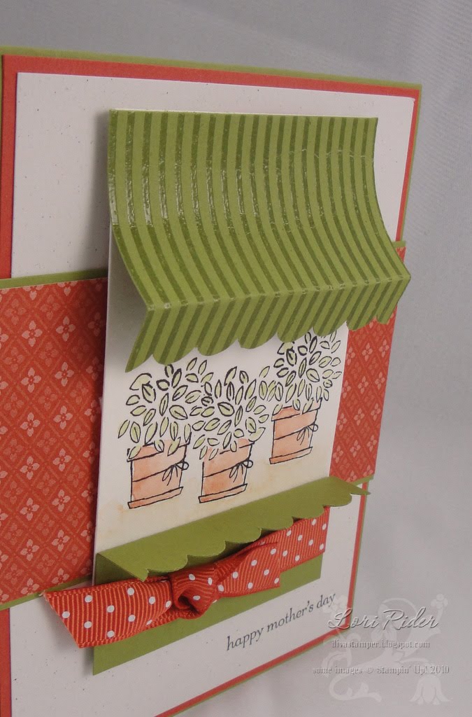
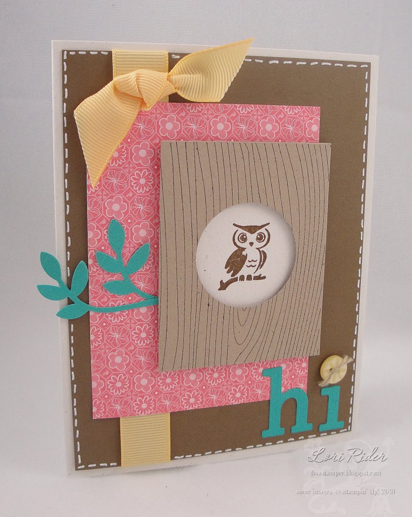
Sorry I'm a bit late posting this kit! It's been a little crazy around here. Here is the May kit. With this card kit you’ll receive complete instructions and all the consumable supplies needed to make 6 of each of these card designs – a total of 12 cards. The price of this kit is just $15, including envelopes.


If you purchase the monthly kit, you will also have the opportunity to purchase the coordinating stamp set at 15% off retail price (tax and shipping not included). This month the featured stamp set is Flight of the Butterfly.

Flight of the Butterfly stamp set regularly $31.95, with purchase of kit $27.16

The rest of the products used in making these cards are given in the list below. If you have all of these then you’re ready to go, but just let me know if you’d like to order any of these items. You can also use the kit to make your cards with the supplies you already own.

Please get your orders to me by May 15. You will receive your kit before the end of the month.

Lori Rider

loririder (at) verizon (dot) net
978-486-8102
divastamper.blogspot.com
 
Local customers click to add to cart: Add to Cart

If you need to receive your kit by mail, click on the "Add to Cart" button below. The shipping calculator is supposed to work for anywhere in the world, which means I can now ship outside the U.S. Let me know if you encounter any problems.

Add to Cart

View Cart

Additional Product List

• VersaMark ($7.50)
• Elegant Eggplant Classic Ink ($5.95)
• Tempting Turquoise Classic Ink ($5.95)
• Garden Green Classic Ink ($5.95)
• Clear Stampin’ Emboss powder ($4.75)
• Embossing Buddy ($5.95)
• Heat tool ($29.95)
• Brayer ($12.50) (or sponge/dauber)
• Paper piercing tool ($3.50)
• Butterfly punch ($15.95)
• Large oval punch ($15.95)
• 1 3/8” square punch ($15.95)
• Trio Flower punch ($15.95)
• Paper snips ($9.95)
• Bone folder ($6.95)
• Stampin’ Dimensionals ($3.95)
• SNAIL adhesive ($6.95)

Please let me know if you have any questions about this month's kit. Thanks so much for your support!

Sunday, May 2, 2010

And we're off

This coming Friday I'm doing a card buffet. I haven't done one since my Twelve Days of Christmas, and obviously I don't have twelve days to get my ten cards ready this time - so it's going to be one busy week of cardmaking! I can think of worse things...


My first card was inspired by the Featured Stamper challenge on SCS. It's been ages and ages since I did a challenge over there. This week the featured stamper is Michelle (aka eliotstamps) and from her gallery I chose this spotlight card. Can you believe I've never done this technique before? I thought that the roses in Elements of Style would be a great image for spotlighting.

I first stamped the image with basic black on whisper white, then punched out a portion with the 1 3/4" circle punch. I used the Circle Scissors Plus to make the black layer circle. I colored the punched image with melon mambo, rose red, old olive and always artichoke markers. Since we don't have border embossing tools, I made the card base vertical and just embossed the bottom with the dot embossing folder. I had to just use a band of ribbon behind the image, and instead of eyelets I used pearls from the Pretties Kit. Once I mounted everything on dimensionals, the card was done, so it's pretty quick and easy, but I think the result is beautiful.

OK, one down and nine to go! If I can manage to get time to blog about my cards as I make them, you will hopefully be seeing more of me this week, and once this week is over, my goal is to find time to play more challenges and post more often than I have been lately. We'll see if I can make that happen. Thanks for visiting today!

Saturday, May 1, 2010

Resurfacing...

I am so sorry I've neglected my blog for so long. First we all came down with a stomach bug. That knocked us out for several days, and it happened in the midst of another project that's been consuming my time. I'm trying to reorganize my stamping space. I've gone through everything and gotten rid of a lot of stuff, and I'm really hoping I will have better organization that will stick and help me keep the space looking nice all the time. I will show you photos when it's ready for public viewing, LOL, but I'm working on it in the middle of getting ready for club, Sarah's birthday, and my mom and stepdad coming from Indiana. I hope in the next week it'll be (at least mostly) done.


For now, though, I do have a card to show you. Our May hostess over at Our Creative Corner, Loretta Lock, gave us a really fun challenge this week: make a Mother's Day card with no flowers. I love a good challenge and this one really got me thinking! I'd seen this card by Vicki Webb and I thought a stencil with a sentiment stamped on top would be super cool, and would give me a place to start that didn't involve flowers.

I chose this stencil from the Elegant Trio set (sigh, remember Carte Postale?) and a monochromatic color scheme of soft suede and very vanilla. I sponged the ink over the stencil with a dauber, very lightly and unevenly to get a vintage look. Then I stamped the sentiment from All Holidays over it. For more vintage style I used the color spritzer and my soft suede marker over the panel. After using the ticket corner punch on both layers, I sponged all the edges for even more shabby goodness.

Early on I thought I wanted to use vanilla satin ribbon. I decided to keep the background simple to allow the image and the bow to shine, so I simply cut a panel of Thoroughly Modern DP to 4 1/4" x 5 1/2", sponged the edges, then wrapped three lengths of ribbon around it before adhering it to the vanilla card base. After I made my bow, I wrapped gold elastic cord around the center, leaving tails to string the Pretties Kit beads. To get the beads to lay flat, I tied the cord in a knot right under the ribbon knot, then strung the beads and knotted the ends of the cord. Tip of the day: Knot the ends of the cord twice or it won't be big enough to hold the beads on. The center of the ribbon didn't look so good with the gold cord wrapped around it, so I just covered that up with one of the larger half pearls from the Pretties Kit.

I have to say, I love how this turned out. I'll be using this for a club card this weekend and I hope my stampers love it, too. All the rest of you, go be inspired by all the other wonderful creations from the OCC team, and thanks for stopping by today!