Wednesday, July 29, 2009

This was one of those cards...


that just didn't want to get done. I spent way too much time on this one - I hope it was worth it! This is my card for today's sketch challenge. Can you believe that I didn't combine it with any other challenges? LOL. I am going to post it to the Verve Divine Details Project Parade because I think it's a good card to explain my own creative process.

Since this was a sketch challenge I started by looking at the sketch and choosing which stamp set I wanted to use. I limited myself a bit in that I decided I would use one of my yet-to-be-inked sets from the new catalog, and I would do my best to make it SUO. Out of that selection the set that fit the sketch best was Gifts of Christmas.

Next I needed to choose colors. I was also trying to decide, did I want to color with markers? emboss? something else? I was just flipping through my cardstock and perfect plum jumped out at me. Based on that I decided to emboss the image onto the plum cardstock. I tried a couple things but in the end went with black EP. So that got me to my first two colors.

The next thing I did was the two black panels. Someone please correct me if this is not true, but I think I may have come up with something new. I first dry embossed the black cardstock with the new Perfect Details texturz plate. Then, as I was looking at it, I wondered what it would look like if I put Versamark onto the dry embossing and then heat embossed with clear EP. The answer is... it looks like this! It's hard to capture in a photo but IRL it looks really cool. It kind of looks like I made my own specialty cardstock. Here is what I did to get it this way:

1. Take the Versamark pad direct to paper (DTP) all over the panel.
2. Cover with clear EP and heat, making sure you really get all of the powder heated.
3. The coverage from the ink wasn't completely even and left some spots that weren't embossed as well, so I repeated the inking and embossing to get better coverage.

Here are a few tips for doing this technique: You'll want strong adhesive because the panels will curl (see photo). I recommend having the panels at the size you want before you emboss so that you don't have to cut into your embossing. And set them aside to cool in a safe place - other embossing powder that you might go on to use will stick if it lands on your panels.

OK, back to my card. At this point I was ready to start putting it all together, but I still hadn't chosen a background. I had been thinking of using white in some way, and I knew I didn't have any patterned paper that would work - but I did have the new Bride specialty paper. Oh my, this paper is gorgeous. I didn't realize until my black panels were done that they were too big to put on an A2 card, so I went for a 5.5" square. The base is perfect plum with a layer of black behind the white. To pick up the white paper somewhere else on the card, I paper pieced the dove. (Just to be safe I stamped on the specialty paper with jet black Stazon.) Deciding on this seems like a no-brainer in hindsight but it took me a while to get to this point. I won't bore you with my trial and error process - it was mostly error!

One thing that I have on most of my cards is ribbon. I just love ribbon, of all kinds, in all colors! I wanted something dramatic but still was trying for SUO. So I took two strips of 5/8" black grosgrain and wrapped them around right next to each other, then I covered the join with a strip of white satin ribbon. Voila - a wide black ribbon!

Now I was ready to attach the panels to the background. The image panel ended up being too small for the layout, so I added a layer in each of the three cardstocks I'd already used to make it larger. I love the result of this. Then it seemed like I had room for some kind of embellishment on the left side, which would be good for balance. I chose the biggest half pearls out of the Pretties Kit - I figured this card was dramatic enough to be able to carry them off! One other item that I use on just about every card is dimensionals. I used pop-up glue dots for the image panel, just to be sure that it would stick, and regular dimensionals for the dove.

So, that's my process... at least for this card! I had fun with this one, despite all the bumps along the way... and now I need to move on to some other work since I spent so much time stamping!

Monday, July 27, 2009

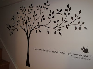
Look what I finally have on my wall!


I've had these Decor Elements since I think March - considering how little time it took to actually put them up, I can't believe I waited this long! It took less than 45 minutes to put up the whole thing. I loved this tree paired with the sentiment as it's shown in the catalog - so I guess I don't win any points for originality but it's really perfect for me and my space. Sorry that the photos aren't the best - it was difficult to get good shots where there wasn't the greatest light and I was dealing with a corner in my way.

I put these up on the wall that's in the stairwell leading up to my office/studio, which you can sort of see in this photo. (I am lucky enough to work and stamp in a wonderful space over the garage that we finished out a few years ago, once we had Ben and my current office became the nursery.) I feel like the quote from Thoreau really expresses what stamping means to me - that after so many years and so many different paths, I think I've finally found what I love to do most and it feels wonderful to be pursuing this passion in my life.

Here are a couple other shots of the tree. It comes in six separate pieces that you put together on the wall to make the whole tree. (The sentiment is sold separately.)

Since this was my first time putting these on my wall, I have just a few tips.

1. Read the directions! and follow them! Let's just say that I started out making a big goof that fortunately I was able to fix.

2. Go sloooooooowly. I often found that the small leaves and letters didn't want to go onto the transfer sheet very easily. It took a lot of rubbing and sometimes even a bit of fingernail to get some of them to transfer initially. Once I figured out how to do it, I got better at it, but if you are a first-timer I would recommend a larger and less detailed image, LOL.

3. You can think of these a lot like rub-ons, on a much larger scale. I recommend trimming around the image somewhat so you have less extra backing material, and always make sure that everything is transferring as you peel off both stages of paper.

4. If you have them, it would be really helpful to have a large flat surface, like a table, available where you're putting these up. I managed to get by just holding the pieces on my lap and using the landing for my flat surface, but a table would have made it a lot easier, had I been able to use one where I was working.

I am sure I will be getting more of these now that I know how easy they are to do. If you want to see the catalog, you can click here - there is such a great variety of these available, as well as stencils. Try it - I think you'll love the result!

Sunday, July 26, 2009

Double feature!


I had a great time with the featured stamper challenge today - so great that I made two cards! The first one was CASEd from this card. I kept the flowers going down the side and the framed sentiment, but I added ribbon and piercing, changed the colors and images, and placed the frame in a different spot. My flowers are from For All You Do (love this new set), the frame from Gallery, and the sentiment from Sincere Salutations. The colors are soft sky (which I still love) and not quite navy, which allowed me to use this gorgeous ribbon from the Elementary Ribbon Originals. All three ribbons in the pack are great, but this ribbon alone makes it totally worth the price!

Here's my second card. This one is a CASE of this card. I kept the top and bottom strips with the offset image panel, but I made it an oval and much larger - not really my intention but that's how it goes sometimes! I left off the ribbon since there wasn't really room, but I added a punched border (EK Success) to the top and bottom panels, and I also included a sentiment and some pearls (Martha Stewart). I stamped these beautiful flowers from Penny Black with Memento tuxedo black on PTI white and colored with Copics. (I'm also submitting this card for the Copic Creations botanicals challenge.) My papers are Basic Grey: Wassail (I figured toile doesn't have to be for Christmas!) and Sultry. The green cardstock is Bazzill Capers, and the sentiment is by Savvy Stamps. I used my new modern label punch for the first time - I love how the pearls fit perfectly into the round bits on the ends!

I've had a great weekend - the IC yesterday was lots of fun, and I've really enjoyed all the challenges I played. I can't promise I will have as much time to create in the coming week, but I hope you'll see me back soon!

Saturday, July 25, 2009

It's not going to happen...

I just have to admit to myself that there is no way I'm going to complete all the DTGD challenges - even by August 1. I'm going to try not to feel too down about it and just enjoy the ones I do get to play!

This card counts for four (!) challenges, to use the following: something clear; something with wings; dies and punches; and ribbon. My clear item is a screen-printed transparency from Hambly. I saw this in a store yesterday, having already seen the challenge from Krystie, and picked it up thinking I could probably figure out something to do with it!

I started by cutting a 4 x 5 1/4" panel of cardstock (Bazzill walnut) then using Nestabilities to cut out an oval from the center. Next I took the card base (Bazzill cameo) and cut out a slightly larger oval from the front. Then I adhered the transparency panel (also 4 x 5 1/4") to the walnut frame and attached it to the card base. That way the inside of the card covers up the adhesive used to adhere the transparency to the frame.

Inside the card I put a panel of Dream Street Secret Garden DP. This photo shows the card more from the side so you can see the window better.

I finished off the front with the bird from Friends 24-7, stamped in close to cocoa on vanilla cardstock, cut out, and adhered with dimensionals. The sentiment from Elegant Cheer was also stamped in cocoa ink and punched with the wide oval. I added a small Prima flower with a half vanilla pearl from the pretties kit to the branch, and then felt like the top needed something. I couldn't wrap ribbon around since the card was all put together, so I cut a length of ivory organdy ribbon and attached it to the card front with mini glue dots, then covered the ends with two more Primas and put the bow in the middle. Nice optical illusion, eh?

This was my first time using any kind of transparency on a card - I enjoyed it, once I figured out what I wanted to do. Maybe you'll be seeing some of the acetate sheets from SU showing up on my cards in the near future... you never know!

Friday, July 24, 2009

Gettin' down and dirty


This is my third year playing along with the Dirty Dozen and their Dare to Get Dirty challenges! This year it's all packed into three days, so I've lost count of how many challenges there have been so far, with more to come tomorrow. I would love to do them all, but the only way I'm going to accomplish that is to combine the heck out of them. So... here is my first "dirty" card, which is for three challenges: to use tags, to make a masculine card, and to use texture.

My tag and matching DP are from the Cosmo Cricket Souvenir collection. I stamped the tree from Forest Friends right onto the tag with chocolate chip ink, then added the cardstock sentiment (by A Muse) with dimensionals. I tied a bit of ribbon - found it at a stamp store, have no idea who made it, but it's wonderful - through the tag.

For texture I used one of the SU texture plates and Bazzill cardstock. I sanded the argyle a bit after embossing it - and I feel the need to point out, this color came out a lot more coral in the photo when really it's a nice brick red. I hate when that happens! I sanded my DP panels on the edges, added three copper brads, and put it all onto a light green card base that was sponged with chocolate chip ink to make it look as dirty as the tag (which I only sanded - no sponging required!).

This card filled an urgent need I had for a masculine birthday card - thanks to the Dirty Dozen for the great challenges! If you are a member of the Fan Club, then go check out the challenges and play along - it's so much fun!

Come and play!


I'm excited to be the guest host for the SCS inspiration challenge this weekend. I know there is a lot going on with the Dare to Get Dirty challenges happening, but I hope you'll find some time to play this one too. We're doing a room challenge (my favorite!) and I picked this pretty living room from Better Homes and Gardens. Here are some shots of various parts of the room, and if you click the link you can see more details. I hope this gives you lots of inspiration! I really loved the cheery colors and all the pretty patterns and flowers in the room.

When I sat down to make my sample card, the shot that grabbed me most was the one of the fireplace. There was something about the lines and composition, the ceramics on the mantel, and the gorgeous pink flowers that just drew me in. I chose my colors first, and I decided to mix some old and new In Colors: melon mambo, bermuda bay, kiwi kiss, tangerine tango, and barely banana. For stamps I picked the new set Greenhouse Garden. (These flower images are gorgeous - I could never have enough flower stamps, and you will definitely want these if you are like me!) I stamped the larger flowers in melon mambo and bermuda bay, and the smaller ones in tangerine. To get the monochromatic look with the two-step images, I inked the full image stamp, stamped off once, then stamped on whisper white. Then I added the accent image with the ink at full strength so it would stand out. I stamped the stems with kiwi kiss on banana cardstock, then cut out the flowers and popped them up on dimensionals. To give the panel some interest I added scoring on the outer edges.

For finishing the card I first made the background of bermuda bay DP, tangerine cardstock, and a kiwi kiss card base. I chose this print of DP based on the tiles around the fireplace. I added melon mambo ribbon around the background layer before adhering it. Placing the image panel on the diagonal was something I discovered completely by accident - I was moving the panel around and I dropped it onto the card base, and it landed diagonally, and I went, "Oh. Wow!" Suddenly the whole thing just popped into place. The frame and sentiment from Great Friend fit perfectly into the lower left corner, and the bow with the kiwi button (threaded with white CS) naturally went on the other side of the flowers. Isn't it amazing how one tiny little thing can make so much of a difference?

OK, are you inspired yet? I hope so! I can't wait to see your creations. You can upload to SCS with the keyword IC190. Have fun with this challenge and thanks for visiting!

Thursday, July 23, 2009

It's been a quiet week in Diva Stamper-ville

Well, not really - but my stamp table has been sorely neglected! I've had some other stuff I've had to catch up on. It's killing me, now that the Dare to Get Dirty challenges have started. (If you're in the SCS Fan Club, you surely know what I'm talking about, and if you're not, why aren't you??) I am hoping to get to as many of those challenges as possible, maybe starting tomorrow. But be sure to stop by Saturday morning (or, okay, late Friday night) for an inspirational post you won't want to miss. Wink, wink!

Sunday, July 19, 2009

Circle Circus


I purchased the Circle Circus set during the preview but haven't played with it much yet. For today's featured stamper challenge I found the perfect card in Diane's gallery (which is lovely) for showcasing this set.

I made my own background with more mustard CS and various images from the set stamped in mustard, soft suede, and ruby red. Then I stamped the larger, bolder images in the same colors and punched them out. For the popped-up circle I stamped the image in ruby red, then added 1/8" punched circles of soft suede and a filigree brad.

I decided to change the ribbon treatment a little by putting it over the sentiment panel. I used the "wonderful" stamp from Wonderful Favorites and accented with two of the smallest circles from the set. And that's it!

Saturday, July 18, 2009

Triple Challenge Triple Play!


I'm checking in with another triple challenge card! I really love doing them when it works out. My three challenges: SCS inspiration challenge, Jen's sketch challenge, and the Our Creative Corner challenge.

For the IC, which used Tracy Porter's gorgeous site, I chose this Mandarin Clove Oil Diffuser - isn't it beautiful? I just loved those colors and patterns. I first stamped the Bella Toile BG with whisper white on dusty durango CS. It doesn't really turn out crisp white, which was OK with me. The other stamp set I used was the hostess set Kind & Caring Thoughts - I thought the flower and leaf images bore a resemblance to the inspiration piece. I stamped the leaf with always artichoke on mellow moss CS, and colored the flower with dusty durango and artichoke markers and stamped twice on blush blossom. There really needed to be a butterfly, so I stamped the Great Friend butterfly with durango ink/CS and cut it out, then placed it on the circle of Jen's sketch.

All the layers are chocolate chip, as is the rub-on sentiment - which counts as one of my three embellishments for the OCC challenge. My other two are Making Memories copper brads and, even though it really doesn't show in the photo, my Sakura Gelly Roll glitter pen. I partially colored the leaves and flowers with the glitter pen, as well as filling in all the open areas on the butterfly. IRL it's a nice subtle sparkle but I guess you'll have to trust me!

Friday, July 17, 2009

Hoppy Thoughts

I'm on a roll... I've made a card each day for three days. How long do you think I can keep it up? :)

Here is today's, for the limited supply challenge. The challenge was to use either your high school colors or your wedding colors. Well, no offense to my high school, but I never liked the colors of gold and black. So I went with my wedding colors, which were navy and yellow. I added white, which we definitely had a lot of, and green, which was certainly there in the leaves of the flowers, at least!

I decided to use the latest Cupcake Challenge from Taylor (welcome back, Taylor!) for my layout. I was still kind of in a Copic mood, so I chose one of the images from A Flower from All Seasons that I thought would work with these colors. I used Y21 lightened with Y000 to approximate barely banana; B37 and B39, with a bit of shading with B21, for night of navy; YG97 and YG99 for the stems, leaf, and frog, to go with old olive; and E74 and E77 for the flower centers. Then I added a bit of a shadow at the bottom and blended it with the colorless blender, maybe too much because I'm not sure you can even see it! The frame was made with Nestabilities and mounted over the image with dimensionals. The LSC also required us to use some "vintage" hardware - I chose this spiral clip and a bit of olive ribbon.

For the rest of the card, I stamped a banana card base with the canvas BG in banana ink. I added a strip of retired olive DP and a sentiment from Teeny Tiny Wishes. To tie in the copper hardware I put three brads along the embossed line of the white circle, then I adhered the sentiment circle to the frame and adhered the whole thing with dimensionals.

That's it - sticking with a cleaner and simpler look today. Thanks for visiting!

Copic Color Throwdown


I made this card yesterday and decided to get out something I hadn't used in a while: my Copics. A few days ago I found this sweet Lockhart stamp at my LSS and thought it would be great with Copics. I was thinking about it yesterday and realized it would work well with this week's Color Throwdown: lavendar lace, garden green, and so saffron. Two of these are colors I rarely use - guess which ones, LOL - so I thought it might be a tough challenge for me but hoped that using Copics would make it more fun!

What I didn't think about when I bought this stamp was that I probably wouldn't want my rocking chair just out in the middle of nowhere. There is a bit of grass drawn on the image, but clearly it was going to need more. And that is much more advanced coloring with the Copics than I had ever attempted. I did a bit of poking around on blogs to get some advice, and then just decided to go for it. I used a whole bunch of colors - sorry that I didn't get a picture, but I think I can give you the numbers.

I started with the smaller parts. I love how the apples turned out. I used YG03 and YG05 with just a bit of YG00 to show where the sun would be hitting them. For the chair frame I used E35 and E37. The basket is Y21, Y23, and Y26, and I colored the tiny butterfly with the lighter two yellows. The quilt and chair cushion (which were harder than I imaged they would be) are BV000, BV00, BV02, and BV04.

Then I had to tackle the grass and sky. I started with YG63 and colored the areas under and around the chair, then shaded with YG67 and blended again with YG63. I kept blending until I was happy with how it looked, and then I went over the grass that's sketched on the image with YG67 one more time. The sky was done with BG000, blended with the colorless blender to smooth out the edges and make it look a little mottled. Tip of the day: You don't want the line around the area you're coloring to be too exact. At first I ended up with a grass- and sky-colored oval, which just looked silly, so I had to go back and rough up the edges.

OK, now tell me, how did I do for my first attempt? I really want to know the honest truth! I do not have any art training so most of the time I feel like I'm winging it. If you are like me and are looking for tips on using your Copics, Marianne Walker's I Like Markers is invaluable. This tutorial from Michelle Wooderson was also really helpful - I think I'll spend more time browsing her blog and see what other tips she has to offer!

Okay, I guess I should just tell you about the rest of the card and get on with my day, LOL. The background is the Cornish Heritage Farms pretty pattern BG (now retired, I believe) stamped with lavendar lace CS/ink. I added a strip of saffron dot paper, and I also wanted to use this card for the Ways to Use It challenge to use two of something, so I added two strips of white crochet trim from JoAnn's. The sentiment is from Sincere Salutations, stamped in garden green and oval punched. The finishing touch for this card seemed to be... buttons! I am loving buttons these days and I'm seeing them everywhere on cards so I must not be the only one. The flower button is saffron from Button Latte and the green ones are from JoAnn's, and I tied them with hemp twine. I layered everything on Bazzill Tokyo CS - it looked good with the color of the chair, and I just felt like I needed a darker color to ground everything.

Thanks for reading all this blabbing and visiting my blog today - I hope you have a great weekend!

Thursday, July 16, 2009

Divine Diva Inspiration Challenge #8


How about some fun retro style this week? I loved these bright and cheery flowers I found at art.com. I thought they were perfect for the middle of summer, and I'm excited to see your inspirations!

For my layout I used the SCS sketch challenge for this week. Kind of an unusual color combo I ended up with... I'm not sure what I think of it. I don't know how much the colors resemble the inspiration piece... but I guess that happens sometimes and I should just move on! ;) I did try to incorporate several of the patterns - dots, swirls, stripes, and damask. It was a challenge to get all of those on the same card but I think the variations in scale make it work OK.

For the flower panel I made the background with bermuda bay CS/ink and the So Swirly (retired) wheel. I stamped the vase (Great Impressions) with soft suede CS/ink. The flowers (Savvy Stamps) I stamped first onto the background and embossed the stems (combination of Versamarker and old olive marker) and then adhered white embossed cutouts of the flowers.

To start on the background I took a soft sky panel and stamped it with my B Line Designs damask BG in soft sky. I wheeled the edges of a soft suede panel with Lots of Dots (also retired) and layered both with bermuda bay. Over that I put a panel of olive paper (from Summer Picnic) and three ribbons (soft sky, white satin, and soft suede). I repeated the soft suede ribbon with the bow, then added a white button threaded with a tiny strip of olive CS. The sentiment is by A Muse.

I can't decide if I like this card or not, but I worked on it long enough that I couldn't start over, LOL. Actually I think I like it more the longer I look at it... or maybe it just looks better in the photo than IRL! ;)

Be sure to check out the cards made by all the Divine Divas for this challenge!

Angela

Chat

Chris

Julie

Keri (Keri is still recovering from surgery and may not be able to join us this week - please wish her well!)

Hope you are inspired to come and play along. Just leave a comment here with a link to your card. We can't wait to see what you create! The keyword for uploading on SCS will be DDIC8. Have fun and look for the next challenge on August 6!

Wednesday, July 15, 2009

Well, this is cool

I was one of the top 20 finalists in the Mojo Monday contest from last week! The card I made was back a few posts (click here to see it). The winners' cards were amazing so congrats to them!! You can see a slide show of the finalists here. I feel like I hardly deserve to be in such amazing company!

No time to post today, but please come back tomorrow for the latest Divine Diva Inspiration Challenge - it's going to be a fun one!

Sunday, July 12, 2009

Button Butterfly Birthday

Here's a quick challenge card for today. When was the last time I played the featured stamper challenge? If I can't remember, then it's clearly been a while! Today's lucky stamper is Kelly (aka schirmcat) who has a huge and lovely gallery. I chose this card because I liked her butterflies so much and had an idea for what my card would be almost instantly.

The starting point for my card was actually this ribbon, which I found on clearance for 25 cents! It's a good match for melon mambo. My next choice was the Great Friend butterfly, which is probably my favorite butterfly stamp. I was trying to decide on a color scheme and decided to check the Walk in the Park DP that matches the stamp set, which is where I found this beautiful saffron paper. Then I knew that I wanted to put a bunch of buttons onto the ribbon, and I pulled out the Button Latte set and found saffron and vanilla there, so I was good to go. (The other buttons are from my vintage button stash.)

I first layered the DP to melon cardstock, punched the corners (with an EK Success punch), and added the strip of ribbon where Kelly had her fence. Next I stamped the butterfly in melon on vanilla cardstock, cut it out, and mounted with dimensionals. I tied my buttons with hemp twine and adhered with glue dots. I chose the sentiment (My Sentiments Exactly) and stamped with melon right onto the saffron paper, then isntead of brads I added a row of piercing under the sentiment. I didn't want to add any more embellishments with all those buttons! To finish up I echoed the piercing in the upper corners and called it done! Not a lot of time today so I kept it simple. Some days are just like that... and that's OK!

Saturday, July 11, 2009

Cheep, cheep!


I got a few minutes to make a card for today's SCS inspiration challenge. This week's challenge is the Chasing Fireflies card, which I've always thought had great stuff. I chose this cute fabric birdhouse - I just loved the colors and the flowers.

I used the set Cheep Talk for my stamping. The branch is old olive, the bird real red and basic black, and the little flowers regal rose. I paired it with this pretty red floral paper from October Afternoon's Cherry Hill line and some regal rose dotted DP, and to mirror the roof of the birdhouse I repeatedly stamped the "because" stamp from Define Your Life. I thought that went well with the "hello there!" sentiment. I used black layers, an olive card base (5.5" square) and a scrap of ribbon and some vanilla brads for embellishments. I love how this turned out!

Thursday, July 9, 2009

Is it that time of year already?

I wouldn't have believed it - but hey, anytime of year is a good time to make Christmas cards! Today's SCS Ways to Use It challenge was to make a Christmas card. I decided that one challenge wasn't enough for me today, so my card also works for two other challenges: the Mojo Monday contest week sketch and the Color Throwdown: real red, tempting turquoise, and kiwi kiss. This is not necessarily a color combo I would have thought of for Christmas, but I had so much fun making my card!

Since this was a Mojo Monday sketch, I decided to use some Verve stamps. This is the Ornamental Christmas set, which I hadn't broken out until today - it's awesome! I cut a whisper white rectangle with a Nesties die, stamped the pine branch on the right side of my whisper white rectangle with the kiwi ink, and added the sentiment (embossed with Ranger rich red EP) in the lower left corner. I realized as I was working that the circle placement in the sketch would be the perfect place for my ornament. It's embossed with the same red EP and the hanger with Ranger gold EP. I added a little Offray gold trim to "tie" it to the branches. I used a larger turquoise scalloped rectangle for the bottom layer, pierced the scallops, and adhered the ornament with dimensionals.

The rest of the card was fairly simple. I embossed the pine branch with gold EP on metallic gold cardstock and used that for the thin strip in the sketch. The red dot paper is from a retired hostess pack, and the kiwi DP is from the patterns pack. The red ribbon is just a scrap I had lying around - no idea what it is or where it came from! That upper left corner of the white rectangle looked too plain, so I tied a bow with the red ribbon and added a gold vintage button with more of the gold trim tied through it.

I spent longer on this card than on any in recent memory... I think it's going to be saved for someone very special on my Christmas card list!

Monday, July 6, 2009

Making good on my promise

Big sigh - just when I was getting ready to sit down and do some challenge cards, my Internet access went out. I still wanted to stamp, so what did I do? I challenged myself! My challenge was to use the new In Colors and the new stamps I preordered but hadn't used yet. I think I did it - although one card isn't done yet. It was really fun, and a good challenge for me to work without anyone else's ideas spurring me on.

Here is the card I made first. I go back and forth on what I think of this one, so tell me what you think. I decided to use the new colors crushed curry, dusty durango and soft suede with the stamp set Autumn Days. I don't yet have any DP in the new colors (shocking, right?) so I searched through my stash and found these papers from SEI's Mimosa collection that look pretty good. I layered onto soft suede cardstock and used a plain white card base to keep it clean. The only embellishing touches I added were a mini library clip tied with hemp twine and a bit of piercing. The sentiment is from Teeny Tiny Wishes - this is going to be a go-to set for me, I can tell.

Next card uses an old retired image - help, I'm blanking on the name of this hostess set and don't have it handy! I love this stamp, though, and I doubt I will ever part with it. I colored the flower with melon mambo and soft suede markers - oh how I love having IC markers - and stamped on vanilla cardstock that I dirtied up with soft suede. I used the eyelet border punch on the melon layer for a little interest. The background has the damask stamp from Friends 24-7 stamped down the side, using the Stamp-a-ma-Jig for placement. I added more sponging, another little sentiment (which set it's from, I'm not sure... it's not Teeny Tiny Wishes), and a bit of soft suede ribbon. The dots on the IC ribbons are so fun!

Last one for today - here's a color combo that mixes rich razzleberry (my favorite of the new ICs so far) with pale plum and so saffron. I have to say I think this combination is gorgeous. I stamped the flower from Cheep Talk three times on white and on razzleberry cardstock (with old olive stems) and punched out the razzleberry centers. I used a panel of saffron dot paper, razzleberry ribbon, a Teeny Tiny Wishes sentiment with oval punches, and a white button tied with hemp twine. Sweet and simple!

OK, now I can finally say that I've inked the new ICs and all of my new stamps. I feel much better! Thanks for stopping by!

Thursday, July 2, 2009

Divine Diva Inspiration Challenge #7


And now for something completely different! I don't know what it was about this artwork from shopSCAD that spoke to me for this week's challenge - I am a cat lover, but I think I also went for the soft colors and the use of the (presumably) vintage items. Plus, it's different than anything I've ever chosen for a challenge, so I hope you have fun with it!

As it turned out, I had a hard time with my own challenge this week. Don't you hate when that happens? Well, here is my card, which I really like, even if it doesn't look much like the inspiration piece. I elected not to use a cat image - I chose the flowers instead. I used old olive, not quite navy, and bashful blue for my colors. The flower stamp is by Magenta - it's an unmounted rubber stamp I picked up a while ago, and it's gorgeous. I stamped with Memento tuxedo black on PTI white cardstock and colored it with Copics. To reflect the circles in the inspiration piece, I used Nestabilities and my SU punches for the image and sentiment (from True Friend). The background uses a bashful blue panel stamped with the little flower from Razzle Dazzle and a panel of paper from the Little Yellow Bicycle Zinnia collection. For embellishment I used a vintage-looking white crochet trim from JoAnn's and an actual vintage button (thanks, Mom!) tied with organdy polka-dot ribbon.

Be sure to check out the cards made by all the Divine Divas for this challenge!

Angela

Chat

Chris

Julie

Keri

Hope you are inspired to come and play along. Just leave a comment here with a link to your card. We can't wait to see what you create! The keyword for uploading on SCS will be DDIC7. Have fun and look for the next challenge in two weeks!