I was working on some cards for my Etsy shop tonight and stumbled across something I thought was cool and wanted to share. I was using the window Framelits and wanted to layer my image, but the die the next size up was just too big - it didn't fit my 3" card and the border was just too wide for my taste. I started looking through my punches and dies to see if I had something else that would look good as a layer. Here is the final product - can you tell what I did? Here's a hint: we have a brand-new product that made this possible...
Did you guess? It all hinged on the new square Framelits. It happens that the set includes a die that gives a 2" square, and that was the perfect size for my 2.5" stamped image from the Best of Flowers set. Then I just needed some circles to finish it off.
Cutting the circles in half gives the perfect layer for each round side; just attach the square behind the label and then add the half circles. Pretty nifty, eh? This might also work for other sizes of labels/squares/circles - remember we also have the new circle Framelits so I'm sure there must be other sizes you could try.
But I have one other little thing to show you. I still had my 3" brown label that I'd cut earlier, so in the interest of using scraps, I cut my first square from the inside of that label. Look at the result:
I'm not sure what I'll do with this little piece, but it was too cute not to save for something! Now I'm very curious what other combinations of dies might create even more shapes. If you try this out, I hope you'll share. Happy crafting!
Showing posts with label tutorial. Show all posts
Wednesday, June 12, 2013
Friday, May 3, 2013
Watercolor Polaroid
I promised to show you one of my club cards for this weekend. The inspiration for this card came from the fabulous Julie Ebersole - you will see a strong resemblance between her card and the focal point of mine. I added a couple elements with the dry embossed background and additional color for the card base. I'm entering in two challenges today: Friday Mashup (embossing) and CAS-ual Fridays (from their tic-tac-toe challenge I used kraft + bling + embossing).
This card started out by the faux Polaroid I found on Pinterest. However, the person who made that used Nestabilities and SU doesn't have anything that would work (yet.... hint, hint). So I went searching online for a tutorial and came across Julie's card. I fell in love with it right away - but for her faux Polaroid she used a punch, and ours isn't nearly big enough. What's a demo to do? Figure out how to make it myself! And now I get to share it with you. Here's how to do it:
1. Cut Whisper White card stock into a piece 3” x 3 3/8”.
2. Position card stock on paper trimmer with the short side
at the top and the right edge aligned with the 1/4” mark to the right of the cutting area.
3. Using the arrow on the cutting blade, position the blade
1/4” from the top of the paper and cut until you reach 2 5/8”.
4. Turn the paper to continue cutting out the center,
leaving 1/4” on each side.
The watercoloring on the punched heart follows Julie's technique. I mixed Pink Pirouette, Primrose Petals and Raspberry Ripple ink (about 3 drops from the reinkers) with about 5-6 drops of water in an artist's palette. I started with the lightest color at the top and worked my way down. Once the heart was dry I used the two-way glue pen and Dazzling Diamonds to add some sparkle. I got mini clothespins at the craft store (ahem) and clipped my heart to some twine, then attached it to my frame with 1/8" brads. The Crumb Cake background is simply embossed with the hexagon folder and adhered to a primrose card base; I put the paper into the embossing folder sideways to leave the bottom plain for the sentiment, which comes from Lovely Thoughts.
Ready to try it yourself? I know there are endless possibilities for using the Polaroid in cards and projects. If you make something I hope you'll share it with me!
Thursday, May 2, 2013
It's all about mom
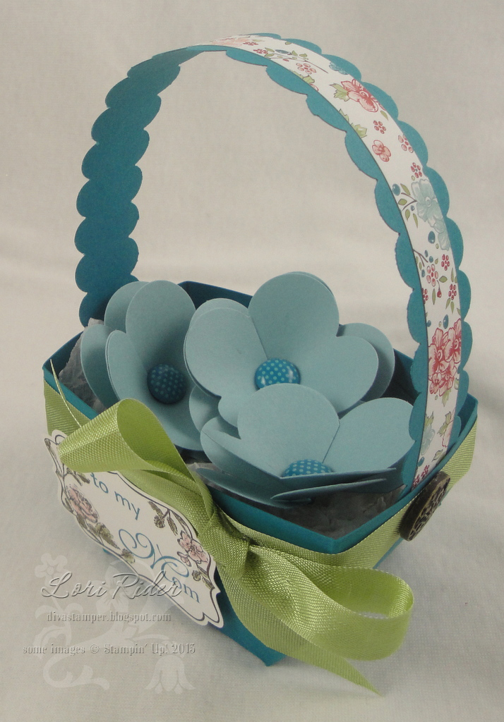
Whew, it's been a while. My stamps have been feeling neglected! But this weekend I have my club so that always gets me stamping. I wanted to share our 3D project, which is a cute basket design I got from Renee Van Stralen a couple years ago. I believe Renee is no longer a demonstrator, but I loved her designs and decided to resurrect this project for a Mother's Day basket. Of course it could work for any occasion - and although this one is pretty small, you could also scale it up easily to make a larger basket.
I'm entering this in the Stampin' Royalty challenge posted yesterday, which is of course to make something for Mother's Day.
The basket is made with a 6 x 6 square of card stock, and here is Renee's diagram for how to score and cut it. You score it into a grid of nine 2" squares, then the corner squares each get cut into three 1" strips.
I'm entering this in the Stampin' Royalty challenge posted yesterday, which is of course to make something for Mother's Day.
The basket is made with a 6 x 6 square of card stock, and here is Renee's diagram for how to score and cut it. You score it into a grid of nine 2" squares, then the corner squares each get cut into three 1" strips.
To assemble the basket, start with one triangle (point at
the top) and glue the first cut strips to the front of the triangle. Then glue
the next strips, alternating as you go to make a criss-cross pattern. The
last pair of strips should make an even horizontal line across the top, then you may have to trim a bit of your triangle that is peeking out. The handle is 1" x 9" and attached to the sides with the large vintage brads.
Here's another shot of it. I took the colors from the Twitterpated DP: Island Indigo, Baja Breeze and Pear Pizazz. (So happy the pear is coming back!! But so sad Baja Breeze is going away!) I wanted some simple flowers to put in my basket, so I punched two flowers and cut toward the center on each petal. The two flowers are put together with a brad, and for the top flower I overlapped two petals so it has four instead of five. The label is from Four Frames, and I used Family Reunion to stamp "to my Mom" in indigo.
I have our two club cards to show you - I will post one of them soon. The other one will have to wait since the recipient reads my blog. ;) Thanks for visiting and have a great day!
Labels:
Anything But a Card,
clubs and classes,
Stampin' Up,
tutorial
Thursday, May 26, 2011
Something new?
Today I'm showing you the technique card we did at my club. I wanted to do an embossing resist technique and I came up with a variation I hadn't seen before - but I don't want to claim that I created something new unless you guys tell me I did! So let me know what you think - is this a new idea, and if by some chance it is, what should I call it? I will say that as I predicted, this card was hard to capture in a photo. IRL it looks really cool, if I do say so myself!
I first took glossy card stock and embossed the foliage image from Fabulous Florets with black craft ink and EP. (Don't forget your embossing buddy!) Next I mixed Poppy Parade reinker with champagne shimmer paint. Using a foam brush, I brushed it over the whole image, then used a paper towel to buff the whole thing. Finally, for more depth of color I brushed another coat of the ink/paint mixture on top and let it dry. I wanted to see the brush strokes - kind of like lacquer, maybe? - so I made sure all the strokes went the same direction and the color was even. With this second coat make sure you don't use too much ink or the brush strokes will disappear as it dries. This will also take a while to dry - in retrospect, probably too long for club unless we had taken the heat gun to it. My gals ended up taking the embossed panel home separately to put the whole thing together later. Once the panel is completely dry, the very final step is to buff it with a clean paper towel, just to make sure no ink is left on the black embossing.
OK, now for the finishing touches - I embossed three flowers with gold EP on black card stock and cut them out. The sentiment from Happy Greetings is also gold embossed. To stick with the gold I used gold card stock as a layer, and two gold brads in each corner give the card just a bit more elegance and shine. Since I featured some brads as my only embellishments, I'm entering this in the Pals Paper Arts brad challenge.
Thanks for stopping by my blog - I hope you'll play around with this technique and tell me what you think. I'd love to see the variations you come up with!
I first took glossy card stock and embossed the foliage image from Fabulous Florets with black craft ink and EP. (Don't forget your embossing buddy!) Next I mixed Poppy Parade reinker with champagne shimmer paint. Using a foam brush, I brushed it over the whole image, then used a paper towel to buff the whole thing. Finally, for more depth of color I brushed another coat of the ink/paint mixture on top and let it dry. I wanted to see the brush strokes - kind of like lacquer, maybe? - so I made sure all the strokes went the same direction and the color was even. With this second coat make sure you don't use too much ink or the brush strokes will disappear as it dries. This will also take a while to dry - in retrospect, probably too long for club unless we had taken the heat gun to it. My gals ended up taking the embossed panel home separately to put the whole thing together later. Once the panel is completely dry, the very final step is to buff it with a clean paper towel, just to make sure no ink is left on the black embossing.
OK, now for the finishing touches - I embossed three flowers with gold EP on black card stock and cut them out. The sentiment from Happy Greetings is also gold embossed. To stick with the gold I used gold card stock as a layer, and two gold brads in each corner give the card just a bit more elegance and shine. Since I featured some brads as my only embellishments, I'm entering this in the Pals Paper Arts brad challenge.
Thanks for stopping by my blog - I hope you'll play around with this technique and tell me what you think. I'd love to see the variations you come up with!
Labels:
clubs and classes,
Stampin' Up,
techniques,
tutorial
Saturday, October 2, 2010
Kindness and Gratitude
It's time for a new month of challenges at Our Creative Corner. Our hostess this month is the fabulous Diane Gilbert! She's starting us off with a color challenge: Cajun Craze, More Mustard, Old Olive, Early Espresso and Very Vanilla. Perfect for those fall cards!
This was the technique card at my club last month. I saw this image from the Day of Gratitude stamp set used with a cool technique that was definitely a "wow" with my club. Meg Loven called it the custom felt pad technique. It's basically this: take a piece of plain-old felt. (I folded mine over so it was three layers thick to keep the ink from soaking through onto my work surface.) Trace the outline of your stamp onto the felt with a pen, then fill the whole outlined area with classic ink reinkers. This will stay wet enough that you can stamp several times without reinking it. It's not going to look precise but it's very cool - try it and see!
The rest of the card was fairly simple. I used a mustard sheet from the Autumn Spice specialty paper and layered several things on it. First I stamped the En Francais background - I know you can't see it, but it's there! Next I used generation stamping with the leaf image from the stamp set. Finally I sponged lots of mustard ink on it - a little bit over the whole panel and even more on the edges. The olive ribbon was knotted with linen thread, then if you cut the thread long enough you can tie the ends through the button and it's all nice and neat. A sentiment from Occasional Quotes finished it off.
I know you'll want to visit the OCC blog and see what the rest of the team created with these fun fall colors. Please come and play along - we couldn't do it without you!
This was the technique card at my club last month. I saw this image from the Day of Gratitude stamp set used with a cool technique that was definitely a "wow" with my club. Meg Loven called it the custom felt pad technique. It's basically this: take a piece of plain-old felt. (I folded mine over so it was three layers thick to keep the ink from soaking through onto my work surface.) Trace the outline of your stamp onto the felt with a pen, then fill the whole outlined area with classic ink reinkers. This will stay wet enough that you can stamp several times without reinking it. It's not going to look precise but it's very cool - try it and see!
The rest of the card was fairly simple. I used a mustard sheet from the Autumn Spice specialty paper and layered several things on it. First I stamped the En Francais background - I know you can't see it, but it's there! Next I used generation stamping with the leaf image from the stamp set. Finally I sponged lots of mustard ink on it - a little bit over the whole panel and even more on the edges. The olive ribbon was knotted with linen thread, then if you cut the thread long enough you can tie the ends through the button and it's all nice and neat. A sentiment from Occasional Quotes finished it off.
I know you'll want to visit the OCC blog and see what the rest of the team created with these fun fall colors. Please come and play along - we couldn't do it without you!
Labels:
clubs and classes,
Our Creative Corner,
Stampin' Up,
tutorial
Thursday, July 8, 2010
Somebody stop me
I know, I know... I'm too busy to be making cards. But I couldn't help it! My new stuff kept calling to me. I got this idea and had to run with it. I stayed up way too late last night because this card just wouldn't let me stop. The upside is I have club next week and we'll use this for our technique card.
I wanted to feature one of our brand-new tools: the distressing kit. This is just an awesome little bundle of goodies: four ink spots and a solid stamp to use them with, plus a sanding block, emory board and three precision files for sanding and distressing just about anything. I was most curious about the inks, so I first took a scrap of naturals ivory card stock, crumpled it up real good, and tested all four inks. The technique is to ink the stamp and then rub it onto the paper. You can see the four colors in the photo. I'll have to play with these more because the inks are blendable and I'm sure there are tons of cool effects you can achieve.
OK, on to my card. I know it looks a little Valentiney (is that a word?) but I'm going with it. The first thing I did was stamp the large image from the new set Notably Ornate with Basic Black ink on Very Vanilla. I let it dry a little - not long enough because when I crumpled the paper it did smear some. But hey, that just adds to the distressed look. I used the charcoal distress ink and then cut the image out.
Next I tackled the chipboard. I don't have any of the new chipboard yet, so I made my own accents with our plain long board and the hearts and brackets die. Now, once upon a time I might have been scared to tackle covering these chipboard brackets, but with the distressing kit it's super easy. I glued on the paper (from the new Love Letter collection), cut out the shapes, and sanded with the emory board. If you need to get into an even smaller space, such as the holes in letters, no worries - the precision files are the answer. So fear the chipboard no more!
All right, let's finish this baby off. I added one more print from the paper pack on the vanilla card base, and on top of that I used a strip of Riding Hood Red card stock trimmed with the Chantilly crochet trim. Love this stuff! I put one of our new black buttons (black buttons! yay!!) on the heart, tied with hemp twine. The die-cut letters (made with Timeless Type dies) added the final touch.
This was really, really fun and I think my club members will love it. They are all experienced enough to handle this, but honestly it's pretty easy. Try it for yourself!
I wanted to feature one of our brand-new tools: the distressing kit. This is just an awesome little bundle of goodies: four ink spots and a solid stamp to use them with, plus a sanding block, emory board and three precision files for sanding and distressing just about anything. I was most curious about the inks, so I first took a scrap of naturals ivory card stock, crumpled it up real good, and tested all four inks. The technique is to ink the stamp and then rub it onto the paper. You can see the four colors in the photo. I'll have to play with these more because the inks are blendable and I'm sure there are tons of cool effects you can achieve.
OK, on to my card. I know it looks a little Valentiney (is that a word?) but I'm going with it. The first thing I did was stamp the large image from the new set Notably Ornate with Basic Black ink on Very Vanilla. I let it dry a little - not long enough because when I crumpled the paper it did smear some. But hey, that just adds to the distressed look. I used the charcoal distress ink and then cut the image out.
Next I tackled the chipboard. I don't have any of the new chipboard yet, so I made my own accents with our plain long board and the hearts and brackets die. Now, once upon a time I might have been scared to tackle covering these chipboard brackets, but with the distressing kit it's super easy. I glued on the paper (from the new Love Letter collection), cut out the shapes, and sanded with the emory board. If you need to get into an even smaller space, such as the holes in letters, no worries - the precision files are the answer. So fear the chipboard no more!
All right, let's finish this baby off. I added one more print from the paper pack on the vanilla card base, and on top of that I used a strip of Riding Hood Red card stock trimmed with the Chantilly crochet trim. Love this stuff! I put one of our new black buttons (black buttons! yay!!) on the heart, tied with hemp twine. The die-cut letters (made with Timeless Type dies) added the final touch.
This was really, really fun and I think my club members will love it. They are all experienced enough to handle this, but honestly it's pretty easy. Try it for yourself!
Friday, May 21, 2010
It's no Monet, but...
I think I like it! I needed a technique card for club tonight and came across the technique called impressionistic stamping on Julie Davison's blog. The basic idea is you stamp on wet paper, let it dry, then stamp again over the first image. It took me some practice to get a look I was happy with, but it's a cool technique.
I already had the stamp set Watercolor Trio (from the summer mini) out, and since Julie had used it on her cards and I liked how it turned out, I decided to follow suit. Otherwise this is my own creation - I had been trying to use a sketch I'd seen posted but it just didn't work out so I went off on my own. I actually do that sometimes, LOL!
For the flower panel I experimented with a few different things. This is what I felt worked best: First I inked up the stamp with melon mambo and old olive markers. Then I spritzed watercolor paper with water just a couple of times and spread the water around with a dry brush. (You could also use an Aqua Painter.) I stamped immediately on the wet paper and let it dry, then stamped the image over top. Despite this being a clear-mount stamp, I still used the Stamp-a-Ma-Jig because to me it looked best when the image was placed exactly where I wanted it. How much water you spray on the paper is a personal choice - I tried between one and four squirts. The more water you use, the more your image will spread. I liked this version because you could still see some of the detail of the image from the first impression - with more water the image was really blurred and I preferred it this way.
For the rest of the card, I used a couple different products: the Very Vintage wheel (soft suede ink on an old olive card base) and the vanilla Smooch Spritz. I stamped a panel of soft suede cardstock with the En Francais background (stamped off once first) then sprayed the Smooch on until it was covered. I finished the layout with a panel of melon mambo designer paper, a strip of 5/8" old olive grosgrain ribbon covered with soft suede, and a sentiment from the same stamp set, using the Matchbox and Lots of Tags dies.
I'm off to keep working on projects for my busy stamping weekend. I will be back tomorrow with my OCC card and I also hope to show you some other stuff I've been working on, if I have time to post - stay tuned!
I already had the stamp set Watercolor Trio (from the summer mini) out, and since Julie had used it on her cards and I liked how it turned out, I decided to follow suit. Otherwise this is my own creation - I had been trying to use a sketch I'd seen posted but it just didn't work out so I went off on my own. I actually do that sometimes, LOL!
For the flower panel I experimented with a few different things. This is what I felt worked best: First I inked up the stamp with melon mambo and old olive markers. Then I spritzed watercolor paper with water just a couple of times and spread the water around with a dry brush. (You could also use an Aqua Painter.) I stamped immediately on the wet paper and let it dry, then stamped the image over top. Despite this being a clear-mount stamp, I still used the Stamp-a-Ma-Jig because to me it looked best when the image was placed exactly where I wanted it. How much water you spray on the paper is a personal choice - I tried between one and four squirts. The more water you use, the more your image will spread. I liked this version because you could still see some of the detail of the image from the first impression - with more water the image was really blurred and I preferred it this way.
For the rest of the card, I used a couple different products: the Very Vintage wheel (soft suede ink on an old olive card base) and the vanilla Smooch Spritz. I stamped a panel of soft suede cardstock with the En Francais background (stamped off once first) then sprayed the Smooch on until it was covered. I finished the layout with a panel of melon mambo designer paper, a strip of 5/8" old olive grosgrain ribbon covered with soft suede, and a sentiment from the same stamp set, using the Matchbox and Lots of Tags dies.
I'm off to keep working on projects for my busy stamping weekend. I will be back tomorrow with my OCC card and I also hope to show you some other stuff I've been working on, if I have time to post - stay tuned!
Labels:
clean and simple,
clubs and classes,
Stampin' Up,
tutorial
Thursday, February 11, 2010
Hey, it's me...

I know you are probably tired of me saying this, but it's really, really true this week... I am so busy!! I haven't had much time to stamp, apart from some cards you'll see on my blog in the next week or so. I made this card a few days ago and thought it was a good time to share it. I made one similar for my dad's birthday - his didn't have the little flowers and pearls, though!
My idea with this card was to make something different out of the new bird punch. I used the Bella Bleu DP and punched a couple of the branches, then from the same paper I punched 7 wings that became the leaves. I glued them right on top of the tiny leaves that are already on the branch. You can't tell this because I put the Boho punched flowers (with Pretties Kit pearls) on top, but it's possible to attach the "leaves" so they completely cover the original leaves. Try it and see - it's very cool!
I finished my card with a Top Note cut from basic black textured cardstock, a kraft taffeta ribbon, a sentiment from the SAB set Vintage Labels, and the frame from Great Friend. I just love the color scheme of vanilla, kraft and black - I think it's so elegant.
OK, it's back to work I go. Thanks for stopping by - I'll definitely be back on Saturday for the OCC challenge so come check that out, too!
Labels:
clean and simple,
punch art,
Stampin' Up,
tutorial
Saturday, November 21, 2009
Craft Fair ABCs
I am now on the other side of my only craft fair event of the season, and I would say that it went well for me, even though attendance was a lot lower than the preschool hoped it would be. I thought I'd share a couple of my favorite ABC projects that are new this year.

Last year my tumbled tile coasters were a big hit at the fair so I figured I'd better make some new ones. Click here for the SCS tutorial on making these. I was working on some other designs and trying to think of what else I could do, when I thought of the Vintage Ornament stencils I'd just received. They are in the Decor Elements catalog, and they are really wonderful! This one was the best size to fit on the tiles - it actually would have fit the whole thing but I liked it better offset a bit. I used daubers and Stazon ink in black cherry and jet black, then added the sentiment from Berry Christmas.

Here's another project - Christmas countdown blocks. I just loved how this set turned out. I made some of these when I first started doing craft fairs two years ago, but I never posted them here. I did find the idea somewhere but I'm afraid the link is long gone... I don't believe a tutorial was posted with that link, though, so here is mine.
1. From your local hobby store get two plain wooden blocks (I used 2" blocks) and an appropriately sized base, and sand edges.
2. If desired, paint base and edges of blocks with acrylic paint. These look great natural too, but I wanted to paint mine white. It took two coats to cover the base, but the blocks looked okay with just one.
3. Cover each side of your blocks with a square of designer paper (my squares are 1 7/8"). I used Basic Grey Eskimo Kisses paper. If possible, it's nice to use 12 different prints so you know two of the same print won't end up next to each other. But if you don't have that many prints to choose from, putting the duplicate prints on the same block will take care of that problem.
4. Add the numbers. You need the following: 0, 0, 1, 1, 2, 2, 3, 4, 5, 6, 7, 8. My numbers are embossed chipboard numbers (naked chipboard by Basic Grey, embossed with old olive craft ink and clear EP). The easiest way to emboss these is to leave them in the chipboard sheet, cover them with ink, emboss, and punch them out.
5. Adhere the numbers to the blocks. In theory these Basic Grey numbers were backed with adhesive but I used Tombow mono multi just to make sure they would stay on. VERY IMPORTANT: It matters how you arrange the numbers so you will be able to make all necessary combinations. On one block you need: 0, 1, 2, 3, 4, 5, and on the other block, 0, 1, 2, 6, 7, 8. Note that you need to make sure your 6 can be turned upside down to make the 9 - for that square use a paper that can be turned any direction and a number 6 that looks OK both ways.
6. I printed the "Days till Christmas" text on the computer onto whisper white then adhered to the base with sticky strip.
For selling these sets I wrapped them in clear cellophane and tied them with a ribbon. I only had two sets and both sold in the first half hour of the fair! So I'd say these were a hit and I'll definitely be making more. I think my kids would love them too, so I'd better make a set for them to keep!
Thanks for stopping by. I know I've been quiet this week - I was actually hoping to stamp today but I woke up with a horrible headache that hasn't really gone away. Maybe tomorrow... I thought I would at least share these projects today, and hopefully I'll be back with more cards soon!

Last year my tumbled tile coasters were a big hit at the fair so I figured I'd better make some new ones. Click here for the SCS tutorial on making these. I was working on some other designs and trying to think of what else I could do, when I thought of the Vintage Ornament stencils I'd just received. They are in the Decor Elements catalog, and they are really wonderful! This one was the best size to fit on the tiles - it actually would have fit the whole thing but I liked it better offset a bit. I used daubers and Stazon ink in black cherry and jet black, then added the sentiment from Berry Christmas.

Here's another project - Christmas countdown blocks. I just loved how this set turned out. I made some of these when I first started doing craft fairs two years ago, but I never posted them here. I did find the idea somewhere but I'm afraid the link is long gone... I don't believe a tutorial was posted with that link, though, so here is mine.
1. From your local hobby store get two plain wooden blocks (I used 2" blocks) and an appropriately sized base, and sand edges.
2. If desired, paint base and edges of blocks with acrylic paint. These look great natural too, but I wanted to paint mine white. It took two coats to cover the base, but the blocks looked okay with just one.
3. Cover each side of your blocks with a square of designer paper (my squares are 1 7/8"). I used Basic Grey Eskimo Kisses paper. If possible, it's nice to use 12 different prints so you know two of the same print won't end up next to each other. But if you don't have that many prints to choose from, putting the duplicate prints on the same block will take care of that problem.
4. Add the numbers. You need the following: 0, 0, 1, 1, 2, 2, 3, 4, 5, 6, 7, 8. My numbers are embossed chipboard numbers (naked chipboard by Basic Grey, embossed with old olive craft ink and clear EP). The easiest way to emboss these is to leave them in the chipboard sheet, cover them with ink, emboss, and punch them out.
5. Adhere the numbers to the blocks. In theory these Basic Grey numbers were backed with adhesive but I used Tombow mono multi just to make sure they would stay on. VERY IMPORTANT: It matters how you arrange the numbers so you will be able to make all necessary combinations. On one block you need: 0, 1, 2, 3, 4, 5, and on the other block, 0, 1, 2, 6, 7, 8. Note that you need to make sure your 6 can be turned upside down to make the 9 - for that square use a paper that can be turned any direction and a number 6 that looks OK both ways.
6. I printed the "Days till Christmas" text on the computer onto whisper white then adhered to the base with sticky strip.
For selling these sets I wrapped them in clear cellophane and tied them with a ribbon. I only had two sets and both sold in the first half hour of the fair! So I'd say these were a hit and I'll definitely be making more. I think my kids would love them too, so I'd better make a set for them to keep!
Thanks for stopping by. I know I've been quiet this week - I was actually hoping to stamp today but I woke up with a horrible headache that hasn't really gone away. Maybe tomorrow... I thought I would at least share these projects today, and hopefully I'll be back with more cards soon!
Labels:
Anything But a Card,
Decor Elements,
Stampin' Up,
tutorial
Saturday, September 26, 2009
Snowflake Pines

Welcome to another fun challenge from Our Creative Corner! This week we are making monochromatic cards (one color plus neutrals of choice). I decided to use one of my favorite colors - blue - which oddly enough I haven't used yet on an OCC card. I'm also breaking out several products from the holiday mini for the first time. This was fun, fun, fun!
I started out by stamping the trees from Patterned Pines (one of the hostess sets you can earn from the mini) with Versamark on night of navy cardstock and white embossing. I used white and bashful blue layers and the ticket corner punch. The background is embossed with the Petals-a-Plenty folder, and for embellishments over the background I used white satin ribbon and silver cord. The sentiment is from Teeny Tiny Wishes (this is becoming my go-to sentiment set) and punched with word window and modern label punches.
I want to highlight my snowflake with a little mini tutorial. I really wanted to layer my snowflake (punched with the new snowflake punch) with both white and bashful blue, so I started playing around just to see what I can come up with. Here is a mini tutorial of what I did.
1. Punch the base snowflake (mine is whisper white) and set it aside.
2. Punch the snowflake you're going to layer on top (mine is bashful blue).
3. Snip off the larger of the "prongs" on each arm of the snowflake.
4. Cut each arm off at desired length (more on the length in a minute).
5. Using any glue pen (I used two-way glue), adhere the layered arms on top of the base arms. Here you can see where I made my cuts. Cut them longer first and see where you want them - if they are too short then the snowflake prongs overlap.
6. Place a small punched circle (mine is 3/4") on the back of your snowflake. This makes the snowflake more stable and also gives you something to put your brad through. I used navy cardstock so it would blend into the background.
7. Put a large brad (mine is a filigree brad) through the center and attach to your project. (Sorry for the slightly blurry photo of my finished snowflake!)
Here is another variation: you can leave a little more of the original snowflake and adhere directly over the base. This gives more of a two-tone look than a layered look. I actually made this one first but ended up using the layered one. I think they are both very cool, though!
OK, that's it from me. Be sure to check out the rest of the OCC team members' samples and prepare to be wowed! We hope you play along this week. Thanks so much for visiting!
Wednesday, July 29, 2009
This was one of those cards...

that just didn't want to get done. I spent way too much time on this one - I hope it was worth it! This is my card for today's sketch challenge. Can you believe that I didn't combine it with any other challenges? LOL. I am going to post it to the Verve Divine Details Project Parade because I think it's a good card to explain my own creative process.
Since this was a sketch challenge I started by looking at the sketch and choosing which stamp set I wanted to use. I limited myself a bit in that I decided I would use one of my yet-to-be-inked sets from the new catalog, and I would do my best to make it SUO. Out of that selection the set that fit the sketch best was Gifts of Christmas.
Next I needed to choose colors. I was also trying to decide, did I want to color with markers? emboss? something else? I was just flipping through my cardstock and perfect plum jumped out at me. Based on that I decided to emboss the image onto the plum cardstock. I tried a couple things but in the end went with black EP. So that got me to my first two colors.
The next thing I did was the two black panels. Someone please correct me if this is not true, but I think I may have come up with something new. I first dry embossed the black cardstock with the new Perfect Details texturz plate. Then, as I was looking at it, I wondered what it would look like if I put Versamark onto the dry embossing and then heat embossed with clear EP. The answer is... it looks like this! It's hard to capture in a photo but IRL it looks really cool. It kind of looks like I made my own specialty cardstock. Here is what I did to get it this way:
1. Take the Versamark pad direct to paper (DTP) all over the panel.
2. Cover with clear EP and heat, making sure you really get all of the powder heated.
3. The coverage from the ink wasn't completely even and left some spots that weren't embossed as well, so I repeated the inking and embossing to get better coverage.
Here are a few tips for doing this technique: You'll want strong adhesive because the panels will curl (see photo). I recommend having the panels at the size you want before you emboss so that you don't have to cut into your embossing. And set them aside to cool in a safe place - other embossing powder that you might go on to use will stick if it lands on your panels.
OK, back to my card. At this point I was ready to start putting it all together, but I still hadn't chosen a background. I had been thinking of using white in some way, and I knew I didn't have any patterned paper that would work - but I did have the new Bride specialty paper. Oh my, this paper is gorgeous. I didn't realize until my black panels were done that they were too big to put on an A2 card, so I went for a 5.5" square. The base is perfect plum with a layer of black behind the white. To pick up the white paper somewhere else on the card, I paper pieced the dove. (Just to be safe I stamped on the specialty paper with jet black Stazon.) Deciding on this seems like a no-brainer in hindsight but it took me a while to get to this point. I won't bore you with my trial and error process - it was mostly error!
One thing that I have on most of my cards is ribbon. I just love ribbon, of all kinds, in all colors! I wanted something dramatic but still was trying for SUO. So I took two strips of 5/8" black grosgrain and wrapped them around right next to each other, then I covered the join with a strip of white satin ribbon. Voila - a wide black ribbon!
Now I was ready to attach the panels to the background. The image panel ended up being too small for the layout, so I added a layer in each of the three cardstocks I'd already used to make it larger. I love the result of this. Then it seemed like I had room for some kind of embellishment on the left side, which would be good for balance. I chose the biggest half pearls out of the Pretties Kit - I figured this card was dramatic enough to be able to carry them off! One other item that I use on just about every card is dimensionals. I used pop-up glue dots for the image panel, just to be sure that it would stick, and regular dimensionals for the dove.
So, that's my process... at least for this card! I had fun with this one, despite all the bumps along the way... and now I need to move on to some other work since I spent so much time stamping!
Saturday, November 29, 2008
ABC Blitz: Post-It Holders, 2008 version
I love playing around with post-it holders, and I wanted to make some using the Sweet Always paper and the coordinating Always stamps in regal rose, pumpkin pie, and chocolate chip. Here is this Christmas's incarnation of the post-it holder, in two versions. The first version uses a belly band to keep the holder closed. You can also see the matching beaded pens I made for these, using Rochelle's tutorial here. These were so fun to make! I'd never done them before but I had all the supplies on hand and wanted to try it out.
The second version of the post-it holder uses the Basic Grey magnetic snaps for a closure. I have to thank the awesome Gina K for helping me out with getting these to work! The trick is to bury the magnet under the layers of paper; otherwise the magnet is too powerful and will just pull off your cardstock after you close the cover. I have as many as three layers of paper in between the two magnets and it holds just fine. For this version I'm showing a monogram, using the Lovely Letters set.
Here is what the inside of the holder looks like. I had orange post-it notes on hand and this seemed like the perfect time to use them. I covered the inside flaps with patterned paper - this covers one half of the magnet if you're using them, but I also like how it finishes off the inside of the holder.
I don't have a full tutorial for you, but here is what I did:
Cut cardstock for holder to 3 3/4" x 8 3/8"
Score at 1 5/8", 2 1/8" from one end
Score at 2 5/8", 3 1/8" from other end
I like to use a square of thin cardboard, like the cardboard that comes with the SU paper packs, behind the center to make it a little sturdier. The size of that panel is 3 3/4" x 3 1/8".
You can change the orientation depending which flap you want to be in front. In the belly band version I put the smaller flap in front, and in the magnetic version I put the larger flap in front. You have to decide which way you're going to go at the point when you attach the post-its to the inside. I adhere the post-its to the holder with sticky strip. The size of the belly band is approximately 1" x 7.5" - since I covered the join with the scalloped circle, I wasn't too exact there.
I hope you'll try these out - they are pretty quick and really fun to do. And I'm curious to hear which of the two closure methods (if any) you like better - I can't decide!
Friday, July 18, 2008
Post-It Note holder tutorial
OK, here's the tutorial I promised you earlier in the week. I made some post-it holders for Christmas last year, but I wasn't entirely happy with them. So after seeing Jen's version with a Velcro closure and Julie's version with a pen holder, I decided to combine the two into my own version. They are still surprisingly easy to make and I think super cute! I made mine with the new Bella Rose designer paper and coordinating cardstock in red riding hood red and kiwi kiss. This will be one of the ABC projects for my Stamping 102 class, although I think it will probably not look exactly like this one.
Disclaimer: I sized my holder to fit the mini gel pens that I bought at Staples. If you find different pens, you may need to adjust the measurements to fit.
Supplies:
9 1/2" x 3 3/4" cardstock sheet
Scor-Pal or other scoring tool (I highly recommend the Scor-Pal for this project)
3 3/4" x 3 3/8" piece of thin cardboard (the backing from the SU paper packs is perfect)
Two coordinating prints of patterned paper
Coordinating cardstock for layers (a scrap will probably do)
Sticky strip (1/4")
Velcro or magnetic closure (I used the magnetic closures by Basic Grey)
Mini pen
Post-it note 3x3 pad
Stamps, punches, embellishments as desired
Step 1. With the large cardstock panel lengthwise on your Scor-Pal, score at 1 3/4", 2 1/8", and 2 1/2". Here are more specific instructions on how I did this:
Score at 2 1/2".

Turn the cardstock the other direction and put your score line at the 3/4" mark and score at the 1 1/2" mark.

Move the outermost score line over 1/8" and score at the 1" mark.

Step 2. With the unscored end of the cardstock to the left, align the edge of the cardstock with the 1/4" mark and score at the 3" and 3 1/2" marks. (If you're not using a Scor-Pal, you will score at 2 3/4" and 3 1/4" from this end.)

Step 3. With the set of three score lines at the top, fold over the first score line into a flap.

Step 4. Open that flap and then fold on the third score line.

Step 5. The middle score line is going to fold the opposite way so that you get an M shape.

Step 6. Open the outer folds back up and hold the cardstock so that the middle score line is at the top, still folded. Cut a slit 1" from each edge, just to the score lines, cutting through both layers.

Step 7. Place the cardstock on your work surface so that the part you just cut forms a "mountain" in the center and put sticky strip on the bottom side of the mountain to the outside of both slits.

Step 8. Remove the tape backing and fold the taped portions down and the cut portion up to make the pen loop.

Step 9. Adhere cardboard to the center of the inside of the holder.

Step 10. Cover cardboard with patterned paper cut to 3 3/4" x 3 3/8".

Step 11. Cover inside flaps with contrasting paper cut to 3 5/8" x 1 5/8" and 3 5/8" x 2 5/8". (I didn't get a photo of this but you can see it further down when I add the post-it notes.)
Step 12. Cover outer flaps with cardstock and paper of your choice. (I actually meant not to use the same print so many times - if I were doing it over I'd make the inside and outside flaps in contrasting prints.) The size of my layers are:
cardstock: 3 5/8" x 1 1/2" and 3 5/8" x 2 1/2"
paper: 3 1/2" x 1 3/8" and 3 1/2" x 2 3/8"

Step 13. Attach post-it pad to inside; I like to use sticky strip for this. I also slide in the pen at this stage so that when I attach the closure, I know where it needs to go.

Step 14. Attach closure. If you are not going to decorate the front, you can attach it to the flaps. Or you can attach it to whatever you add to the front; see Jen's blog link above for this method. I attached it to the flaps but really should have done it Jen's way. Oops! Well, now you can see both.

Step 15. Decorate the front as you wish. For mine I used the small flower from Live Your Dream - side note, doesn't this just about match this paper perfectly? I am beside myself with the possibility that this set will be in the new catalog - colored with red riding hood red and kiwi kiss and a blender pen, and a stamp from Warm Words in red riding hood red. I made the scallops with the new scallop edge punch - love it!!
Disclaimer: I sized my holder to fit the mini gel pens that I bought at Staples. If you find different pens, you may need to adjust the measurements to fit.
Supplies:
9 1/2" x 3 3/4" cardstock sheet
Scor-Pal or other scoring tool (I highly recommend the Scor-Pal for this project)
3 3/4" x 3 3/8" piece of thin cardboard (the backing from the SU paper packs is perfect)
Two coordinating prints of patterned paper
Coordinating cardstock for layers (a scrap will probably do)
Sticky strip (1/4")
Velcro or magnetic closure (I used the magnetic closures by Basic Grey)
Mini pen
Post-it note 3x3 pad
Stamps, punches, embellishments as desired
Step 1. With the large cardstock panel lengthwise on your Scor-Pal, score at 1 3/4", 2 1/8", and 2 1/2". Here are more specific instructions on how I did this:
Score at 2 1/2".

Turn the cardstock the other direction and put your score line at the 3/4" mark and score at the 1 1/2" mark.

Move the outermost score line over 1/8" and score at the 1" mark.

Step 2. With the unscored end of the cardstock to the left, align the edge of the cardstock with the 1/4" mark and score at the 3" and 3 1/2" marks. (If you're not using a Scor-Pal, you will score at 2 3/4" and 3 1/4" from this end.)
Step 3. With the set of three score lines at the top, fold over the first score line into a flap.

Step 4. Open that flap and then fold on the third score line.

Step 5. The middle score line is going to fold the opposite way so that you get an M shape.

Step 6. Open the outer folds back up and hold the cardstock so that the middle score line is at the top, still folded. Cut a slit 1" from each edge, just to the score lines, cutting through both layers.

Step 7. Place the cardstock on your work surface so that the part you just cut forms a "mountain" in the center and put sticky strip on the bottom side of the mountain to the outside of both slits.

Step 8. Remove the tape backing and fold the taped portions down and the cut portion up to make the pen loop.

Step 9. Adhere cardboard to the center of the inside of the holder.
Step 10. Cover cardboard with patterned paper cut to 3 3/4" x 3 3/8".
Step 11. Cover inside flaps with contrasting paper cut to 3 5/8" x 1 5/8" and 3 5/8" x 2 5/8". (I didn't get a photo of this but you can see it further down when I add the post-it notes.)
Step 12. Cover outer flaps with cardstock and paper of your choice. (I actually meant not to use the same print so many times - if I were doing it over I'd make the inside and outside flaps in contrasting prints.) The size of my layers are:
cardstock: 3 5/8" x 1 1/2" and 3 5/8" x 2 1/2"
paper: 3 1/2" x 1 3/8" and 3 1/2" x 2 3/8"

Step 13. Attach post-it pad to inside; I like to use sticky strip for this. I also slide in the pen at this stage so that when I attach the closure, I know where it needs to go.

Step 14. Attach closure. If you are not going to decorate the front, you can attach it to the flaps. Or you can attach it to whatever you add to the front; see Jen's blog link above for this method. I attached it to the flaps but really should have done it Jen's way. Oops! Well, now you can see both.

Step 15. Decorate the front as you wish. For mine I used the small flower from Live Your Dream - side note, doesn't this just about match this paper perfectly? I am beside myself with the possibility that this set will be in the new catalog - colored with red riding hood red and kiwi kiss and a blender pen, and a stamp from Warm Words in red riding hood red. I made the scallops with the new scallop edge punch - love it!!
Tuesday, July 8, 2008
Flip Album - my version, with tutorial
Okay, think waaaaay back to March, LOL. Remember this flip album that I made? Well, I've been revisiting it for a couple reasons. One was that a good friend requested that I make some for her, and I'm finally getting around to it - at least here's one done, LeAnn. :) The other reason is that after I posted my original album, a very sweet stamper - I don't remember her name, sorry! - took the time to look up my phone number and call me to ask me some questions about it, and I promised that someday I would make a tutorial on it. So I'm finally getting around to it, and I hope that wherever she is, she's reading and sees this!
My album is based on Chiaki Haverstick's directions here. I have made a few changes, which is why I'm doing my own tutorial - I don't want to take anything away from Chiaki's wonderful work or try to one-up her or anything, really! Mostly my changes relate to the fact that when I made mine, it didn't want to close very well, so I made some modifications that, for me, have helped with that issue.
I was also semi-inspired by Erin's lovely baby girl album. I started out intending to use this same scrappin' kit but I messed it up, so I used the wedding kit Tie the Knot instead. So, let's get started! Let me just say, do not attempt to do this when you are either tired or in a hurry, or both - it's a little complicated, and if anything in my tutorial doesn't make sense, please let me know! And remember, if you click the photos you can see them larger.
Supplies:
2 sheets 12x12 cardstock in color 1
1 or 2 sheets 12x12 cardstock in color 2 (I used 2)
Extra coordinating cardstock for layering (I used one sheet each of the two other colors in the kit)
Coordinating designer paper (I used 3 of the double-sided sheets in the kit)
Coordinating borders and stickers from kit (optional)
Paper trimmer
Scor-Pal or other scoring tool
Sticky strip or similar strong adhesive
SNAIL or other tape runner
Ribbon - one piece approx. 2 ft. in length
Cardstock, stickers, stamps, punches, etc., for decorating pages as desired
Step 1. Cut color 1 cardstock as follows:
6" x 12" (1 piece), 5.75" x 12" (3 pieces)
Step 2. Cut color 2 cardstock into 5.5" squares. You will need at least 4; I used both sheets to get 8.
Step 3. Score your 6x12 cardstock 2 7/8" and 2 5/8" from each end. If you're using the Scor-Pal, you can position the edge 1/8" in from the left, then move in another 1/4" for the second score line.
Step 4. Fold on each score line to make your cover. It will wrap around the flap pieces on the inside. When finished it will look like this:
Step 5. Score your other color 1 pieces 3" from each end. (Note: if using textured cardstock, you want to score them all on the same side - textured side up or down on all three. I scored with the textured side down.) Then fold on the score lines. These will make the inside flaps. I'll refer to them as the inside pieces.
Step 6. Take one of your inside pieces and apply sticky strip to the left flap. Leave at least 1/8" between the score line and where you place your tape.
Step 7. Take another of the inside pieces and line up the right score line with the right strip of tape on the bottom piece. This will leave the right flap of the top piece free to open and close. Remember to maintain that 1/8" clearance between the score lines on your top and bottom layers - this is important for helping the album to close well.
Step 8. Fold this left set of flaps closed and apply sticky strip to the flap on the right side of your bottom piece, again leaving at least 1/8" clearance from the score line (which should approximately line up with the folded flap).
Step 9. Attach third inside piece to the right flap in the same way as in step 7. When all three pieces are connected, it should look like this when open:
Step 10. Turn your attached inside pieces over (flaps should be facing down) and apply sticky strip to the solid square in the center. (I actually put the tape all the way around the square - just took the photo too soon. Sorry!)
Step 11. Take your cover piece and lay it on the work surface open, with the inside of the cover facing you. Place the center square of the inside pieces so that it is centered within the square of the cover piece and adhere. Now your album should look like this, first open:
And closed:
Step 12. Take four of your color 2 5.5" squares and decorate as desired. Remember that one is going to be on the front cover of your album.
Step 13. Take your strip of ribbon and wrap it around the closed album, leaving the same length of ribbon free on the right side on both ends.
Step 14. Take your decorated cover square and adhere sticky strip only on the left side - otherwise when you adhere it, it could stick to the rest of the album. Holding the ribbon in place, adhere the left side of the square to the left cover flap. I suggest leaving a slightly larger margin on the left side, or else the right edge of your cover piece on the other flap may show when the album is closed.
Step 15. Open this cover and secure the ribbon to the back of your decorated square with Scotch tape, then adhere a second square to the back of the first square so that your flap is now enclosed.
Step 16. Secure the ribbon to the back of your album with the tape runner.
Step 17. Repeat the same process for the other cover flap with your two remaining decorated squares, only this time the ribbon does not go between your squares. Keep it off to the right so that you can tie your bow when you're all done.
This shows the fourth square, open (the ribbon tail is covered up when this flap is open):
Now you are ready to decorate the rest of your album. You have five more square surfaces and eight flap surfaces. I ended up using some of the brown on my flaps and cutting a couple squares of a different color cardstock from the kit. Note: I highly recommend using the sticky strip to adhere your various pieces, especially if they are going onto textured cardstock.
If you wish to use layers for the flaps as I did, the measurements are:
Cardstock bottom layer is 5.5" x 2.75"
Designer paper or lighter cardstock layer is 5.25" x 2.5"
Here's how the rest of my album looks. This is the first flap open, showing the inside half of the "cover":
This shows the center and right of the album when the second cover flap is open:
Now I've opened the "This Day and Always" page to show the first set of flaps. The center "love" page is the back of the second set of flaps.
This shows the very back of the inside, once the second set of flaps is flipped over.
First set of flaps open:
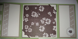
Second set of flaps open:
The whole album opened up:
Whew! I think that was almost as much effort as making the album itself. ;) I really love how it turned out. I encourage you to try this out yourself - the scrappin' kits make it easy to embellish the pages since you can cut the border strips to whatever size you want or use your punches to change the shape of the stickers. If you do try this version, leave me a link so I can see your creation, and please give me feedback on the tutorial if anything is confusing or doesn't seem to work for you. This is my first time doing a tutorial as complex as this one and I want to know if something doesn't make sense. Really!
Here's a rundown of what I used in my album:
Tie the Knot Simply Scrappin' kit
Extra very vanilla plain cardstock for some layers and stamping
Chocolate chip and certainly celery ink
To Have and To Hold and Together Forever stamp sets
Kraft taffeta ribbon
Dimensionals for cover
Scallop, 1 1/4" and 1 3/8" circle, and photo corner punches
Subscribe to:
Posts (Atom)