Tuesday, May 21, 2013

Happiness Always

I get the pleasure of going to three cousins' weddings this summer - and of course that means I get to make some wedding cards! It's not a category I need very often, so I'm looking forward to it. This weekend is the first of the three weddings, so here is my first card. I'm entering in a few challenges: Pals Paper Arts (sketch), Fusion Card Challenge (inspiration photo), Friday Mashup (monochromatic), and SUO Challenges (retiring stamp set: Happy Thoughts).


From the Fusion inspiration photo I took the flowers and dots, and the CAS look of the photo. I chose brown because it became clear to me, after looking at their registries, that the bride and groom love brown! This is Soft Suede with the naturals ivory card stock. I featured the Pleasant Poppies stamp and added some pearls and distressing. I layered the crochet trim and Soft Suede taffeta ribbon under the sentiment, which is so beautiful - I'm sad it's retiring because I didn't get to use it very often. All in all this card came together quite quickly - which is perfect since I didn't have a lot of time. But I hope my cousin and his future wife will love it!

Friday, May 3, 2013

Watercolor Polaroid

I promised to show you one of my club cards for this weekend. The inspiration for this card came from the fabulous Julie Ebersole - you will see a strong resemblance between her card and the focal point of mine. I added a couple elements with the dry embossed background and additional color for the card base. I'm entering in two challenges today: Friday Mashup (embossing) and CAS-ual Fridays (from their tic-tac-toe challenge I used kraft + bling + embossing).

 
This card started out by the faux Polaroid I found on Pinterest. However, the person who made that used Nestabilities and SU doesn't have anything that would work (yet.... hint, hint). So I went searching online for a tutorial and came across Julie's card. I fell in love with it right away - but for her faux Polaroid she used a punch, and ours isn't nearly big enough. What's a demo to do? Figure out how to make it myself! And now I get to share it with you. Here's how to do it:
 
1. Cut Whisper White card stock into a piece 3” x 3 3/8”.
2. Position card stock on paper trimmer with the short side at the top and the right edge aligned with the 1/4” mark to the right of the cutting area.
3. Using the arrow on the cutting blade, position the blade 1/4” from the top of the paper and cut until you reach 2 5/8”.
4. Turn the paper to continue cutting out the center, leaving 1/4” on each side.
The watercoloring on the punched heart follows Julie's technique. I mixed Pink Pirouette, Primrose Petals and Raspberry Ripple ink (about 3 drops from the reinkers) with about 5-6 drops of water in an artist's palette. I started with the lightest color at the top and worked my way down. Once the heart was dry I used the two-way glue pen and Dazzling Diamonds to add some sparkle. I got mini clothespins at the craft store (ahem) and clipped my heart to some twine, then attached it to my frame with 1/8" brads. The Crumb Cake background is simply embossed with the hexagon folder and adhered to a primrose card base; I put the paper into the embossing folder sideways to leave the bottom plain for the sentiment, which comes from Lovely Thoughts.
 
Ready to try it yourself? I know there are endless possibilities for using the Polaroid in cards and projects. If you make something I hope you'll share it with me!

Thursday, May 2, 2013

It's all about mom

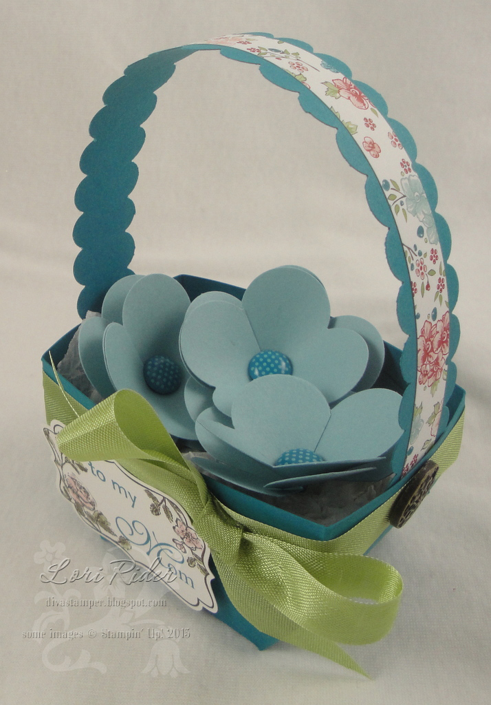
Whew, it's been a while. My stamps have been feeling neglected! But this weekend I have my club so that always gets me stamping. I wanted to share our 3D project, which is a cute basket design I got from Renee Van Stralen a couple years ago. I believe Renee is no longer a demonstrator, but I loved her designs and decided to resurrect this project for a Mother's Day basket. Of course it could work for any occasion - and although this one is pretty small, you could also scale it up easily to make a larger basket.

I'm entering this in the Stampin' Royalty challenge posted yesterday, which is of course to make something for Mother's Day.


The basket is made with a 6 x 6 square of card stock, and here is Renee's diagram for how to score and cut it. You score it into a grid of nine 2" squares, then the corner squares each get cut into three 1" strips.


To assemble the basket, start with one triangle (point at the top) and glue the first cut strips to the front of the triangle. Then glue the next strips, alternating as you go to make a criss-cross pattern. The last pair of strips should make an even horizontal line across the top, then you may have to trim a bit of your triangle that is peeking out. The handle is 1" x 9" and attached to the sides with the large vintage brads.
 
 
Here's another shot of it. I took the colors from the Twitterpated DP: Island Indigo, Baja Breeze and Pear Pizazz. (So happy the pear is coming back!! But so sad Baja Breeze is going away!) I wanted some simple flowers to put in my basket, so I punched two flowers and cut toward the center on each petal. The two flowers are put together with a brad, and for the top flower I overlapped two petals so it has four instead of five. The label is from Four Frames, and I used Family Reunion to stamp "to my Mom" in indigo.
 
I have our two club cards to show you - I will post one of them soon. The other one will have to wait since the recipient reads my blog. ;) Thanks for visiting and have a great day!

Thursday, April 25, 2013

Retirement party!


I'm sure you've heard by now - the Stampin' Up! retirement lists are here! Click HERE for the list of retiring stamps and HERE for the accessories. Check the list - they update the items that are sold out (sniff!) and you'll want to get your favorites now!

How would you like to win $25 in hostess dollars? To get a chance to win, all you have to do is place an online order using my special hostess code. Here's how:

Go to my online shop HERE and fill your cart. You can order any amount to qualify. You do have to have an account to shop online.

At the bottom of the screen is a box to enter the hostess code, which is: E3E97XF4
Don't forget to enter the code! Only orders that use the code will be entered, and the order has to reach $150 in order to earn the benefits, so feel free to tell your friends!

The hostess code will close on May 7 and I will notify the winner on May 8.

If you don't win but you would like your very own hostess benefits, you can get your own code! It's like having an online workshop. You can share the code with anyone in the US and you get credit for the order. Please contact me at loririder (at) verizon (dot) net if you'd like to have a virtual party and earn hostess benefits for yourself!

OK, time to get shopping! Don't wait before that stamp set or color or paper you wanted is gone - for good!

Saturday, April 20, 2013

It's sad to say good-bye...

This post is a difficult one to write. After several years of being part of the team at Our Creative Corner I have decided it's time to step down. I will really miss this fabulous team - I can't quite believe it's been this long, but I joined in September 2009. WOW. Time goes by so fast!

The OCC will be undergoing some changes as our leader, Linda Coughlin, will be handing the reins over to a new artist. More details will be coming about that, but for now Linda asked us to repost a former project as a way of saying "good-bye (for now)." I looked back over everything I made for the OCC and it was really hard to choose just one project, but in the end I settled on this card.


This fussy-cutting hydrangea card represents a couple things I think of as my style: clean and simple, and, well, fussy! For more details on the card you can click back to my original post from 2011.

I'm kind of at a loss for words as to how to sum this experience up - I've had the pleasure of working with so many wonderful and talented stampers, and I've loved the challenges I've gotten to play with over the past 3.5+ years. There have been times when if it weren't for the OCC, I probably wouldn't have been stamping and blogging at all, so I'm grateful to have had this opportunity. Best wishes to all my former and current teamies, and to the new OCC as it goes forward.

I hope I'll have a chance to be on another DT in the future - I'm guessing the spring and summer are going to be pretty busy and my posts may be sporadic. But I'll still be here when I can, work and other commitments notwithstanding!

Saturday, April 13, 2013

Pretty Punch Art

Hello again - well, the good news is that I'm feeling better, but the bad news is that I'm getting busier and finding it harder to get any stamping done. I'll keep trying, though! Anyway, today is Saturday so of course we have a new Our Creative Corner challenge for you. Rudlis is hosting today and asked us to use fashion/mannequins/style/stitching/etc. as our inspiration point. This was tough for me - I don't have any of those trendy dress stamps or dies, so I had to get creative!

 
I made this sweet little dress with a couple different punches and Twitterpated DP in Riding Hood Red (one of our retiring colors). The skirt is from the blossom builder punch, and the top is part of the owl punch - I cut the sweetheart neckline and the skirt's scallops myself. I added the ribbon punch for a belt with a punched flower and rhinestone trim. For the stand, I used a thin strip of Early Espresso card stock with a decorative label punch base and a mini ornament punch for the finial. The banner punch and red DP are non-SU - I embossed the DP with the dot folder. To set off the punch art I added the label with pierced edge and a strip of espresso DP. The sentiment, which I embossed in white, is from the retired set Watercolor Trio.
 
OK, you have your challenge - please join in with us this weekend! Make sure you check out what everyone else on the DT created as well. We are grateful for your participation! Have a great weekend!

Saturday, April 6, 2013

Thoroughly Modern Madison

Good morning! I'm back with my second challenge for Our Creative Corner. Here's what I came up with:


My hubby would never go for this bedroom, LOL! But sometimes I think the modern aesthetic is just very cool so that's what I was going for. This is my card:


This is one of those cards that when I sat down to make it, I really had no idea what I wanted to do. I actually started out using a sketch challenge but in the end I changed the layout completely because it just worked better this way. Since I have such good timing, I finally broke out the Madison Avenue stamp set that was recently available during Sale-a-Bration. Yeah, I didn't stamp too much during SAB. But these images spoke to me as a way to create some modern patterns with these bold colors (Raspberry Ripple, Island Indigo, More Mustard, and Soft Suede). Thanks to the Stamp-a-ma-jig the two background panels came together fairly quickly. I tried to use the Madison Avenue flower for the focal panel but it wasn't working somehow. This flower from World Treasures pulled everything together and keeps the modern feel. I added tiny punched circles from the cupcake and owl punches to bring in the indigo and mustard colors. My texture comes from the embossed stripe background, the popped-up elements, and the indigo brad. For my sentiment I grabbed the retired set Pocket Silhouettes and one of the bitty banner dies - after I cut it out, I glued it onto suede card stock and cut around it to make a layer to match the rest of the card.

I hope you'll play along with this challenge - I will admit that it might not be an easy one, but isn't that the point of a challenge? :) Be sure you visit the rest of the team and give them some love for their projects too. Have a wonderful weekend!

Thursday, April 4, 2013

Just believe in spring

Is spring actually coming? Today (at least here) the sun is shining and it's almost warm enough to go out without a coat... I'm hopeful that the snow will fully melt soon! I think I was channeling spring when I made this card. Something about it feels fresh, like the spring air outside...


My club will make this card tomorrow. I like to do something with a technique so we're going to do two-tone embossing. Not that there is much to this as a technique - but it's something we haven't done before. I also used the Mojo Monday sketch from this week.

The whole card came from the embossing - I wanted to use colors and I only had Gumball Green and Pool Party, LOL. I thought they would look striking with this image from Just Believe on Early Espresso card stock, and I think I was right - it turned out just like I hoped it would. The circle flower image is from the same stamp set, and the sentiment is from Itty Bitty Banners. I used DP from the 4x6 pack in the spring catalog - the name escapes me right now. And the large scallop trim was cut with the Tasteful Trim die and then embossed with the fan embossing folder. It all went onto a vanilla card base embossed with the woodgrain folder.

I just feel happy after making this - happy to be feeling better and back to stamping, and happy that spring is on its way! I hope you like the card and really appreciate your stopping by today!

Saturday, March 30, 2013

Dare to dream...

Hey, sorry to disappear there on you. Three weeks ago I woke up with awful spasms in my back - it's something I've had before and I assume it has to do with my TMJ. It has always gone away in the past but this time it's sticking around. I've spent a lot of hours resting with a heating pad, not able to do much more than read and browse the web on my laptop. I'm slowly getting better and I'm getting physical therapy now, but it's still hard to be up and around all day. Life does go on, though, and I really had to stamp this week because... I'm hosting the challenges at Our Creative Corner for the next two weeks! It's been a very long time since I've had the honor.

My challenge is to make a card or project inspired by travel and/or transportation, using at least two different designer papers. When I chose this challenge theme, I was in the midst of planning the trip my family is taking to Germany this summer. I absolutely love to travel, and this will be my first time to see Germany and my kids' first trip overseas. We are all really excited! Anyway, here is my card, using the colors from colourQ, which I haven't played in ages and love to pieces, and a sketch challenge that's new to me, Paper Craft Crew.


The stamp set I featured is called Postage Due. I stamped the collage image in Pool Party and then sponged Wisteria Wonder over the whole panel and Always Artichoke on the edges. (All the edges are distressed and sponged.) The postage stamps in this set are super cute, and I chose the "Paris" one. My two DPs come from the patterns pack and Twitterpated. I thought "dare to dream" was a perfect sentiment for thinking about travel - this stamp comes from Loving Thoughts. The card base is Core'dinations card stock sanded on the edge. Those little punched flowers started out a little simpler, but when I took the first photo I realized they just didn't look right and redid them. Sometimes I can let those things go, but it was easy enough to change, so perfectionism won out this time!

I hope you will play along with our challenge this week - we love to see what you come up with and we love when you join us in creating something special. Have a great weekend, and a happy Easter to those who celebrate - maybe spring is coming finally?? Hope so!

Saturday, March 9, 2013

Copper Patina

Well, we've had another snowy week... hard to believe it's Saturday again already. This week's Our Creative Corner challenge is another fun one from Meihsia Liu. She gave us this photo as inspiration and required at least one metal embellishment.


I wasn't really sure what I wanted to do with this one, so I started looking at sketches and decided to use the latest from Freshly Made Sketches. (Hope I didn't tinker with it too much!) Here is my card:


I wanted to try some sponging to see if I could achieve that cool patina look. I knew I had (non-SU) copper embossing powder lying around, and the Fresh Vintage stamp set from last year's SAB jumped out at me. Over the embossed images (on vanilla card stock) I sponged Tempting Turquoise and a tiny bit of Bermuda Bay, then I used Cajun Craze on the edges of the squares (and likewise on all the rest of the panels). I also used the distressing tool to rough up all the edges. I liked the idea of the bright blue accent (the rhinestones on the top of the candle holder) so I brought that into my card with rhinestones colored with a Sharpie and Pacific Point card stock. The background is Cajun Craze embossed with the vintage wallpaper folder, then Pool Party (which is basically the color my sponging ended up being) and Pacific Point on a vanilla card base. For the metal I pulled out my ancient box of Hodgepodge Hardware - I have a whole bunch of it left, LOL. The frame looked kind of bare stuck on by itself so I added some Pool Party ribbon behind it. The sentiment is from Teeny Tiny Wishes. I'm not sure what I think of this one - I liked it better without the sentiment, I think. Maybe I will have to revisit this idea sometime...

I hope you will play along with our challenge this week - it made me think outside the box, which is good! The rest of the team have gorgeous creations for you to see, so don't miss those also. Have a great weekend and cross your fingers that spring is coming soon!


Saturday, March 2, 2013

A flower and a crown

Hello with another Saturday post - time for Our Creative Corner's weekly challenge! This week our challenge is hosted by Meihsia Liu. She has a pretty vintage-and-shabby inspiration challenge, and we are supposed to use fabric flowers and a crown. The photo:


And here is my card, using a layout from the Pals Paper Arts sketch challenge:


For this one I chose soft colors: Baja Breeze, Pear Pizazz, Crumb Cake, Blushing Bride, and white. I used a strip of Tea for Two fabric to make a rolled flower - the leaves are from the bird punch and embossed with the houndstooth folder. The lace panel was made by sponging pink ink over the lace tape from the spring mini, then gently peeling the tape off to reveal the white cardstock underneath. For the background I used white cardstock embossed with dots and retired pear DP. The sentiment is from Perfectly Penned, and the buttons are retired from SAB last year. As for the crown... well, I struggled with that. This little image from Tiny Tags was the only crown I had, so I stamped it and embossed with pewter EP, cut it out, and added it to my sentiment.

This card makes me think of spring, which I hope is coming soon! I'm so sick of the snow. Come join in our challenge and don't forget to visit the OCC blog to see the rest of the team's shabby chic goodness! Have a great weekend!

Saturday, February 23, 2013

Have a super birthday!

Saturday already? These weeks are flying by! I'm here with my card for this week's challenge for Our Creative Corner. This week our host is Paula McClane, and she has a fun challenge for us - she is hosting a murder mystery party for her birthday, which is today - so happy birthday to Paula! The theme of her party is super heroes - so we are being asked to make a layer-cake birthday card in red, yellow and blue. Here is mine:


For my cake I chose the image from Make a Wish. The colors I picked are Island Indigo, Cherry Cobbler and Daffodil Delight (plus white). I did one layer in each color, cut them out, and popped them up in the center of a framelit-cut oval. The indigo label was embossed with the polka dot folder, then I added cherry faux stitching with a marker and a cherry seam binding bow. The simple background is two panels of designer paper, then I added the sentiment from Itty Bitty Banners.

I hope everyone has a great weekend - guess what, it's going to snow again here in Massachusetts! Maybe I'll get some extra stamping time if we get snowed in. I hope everyone gets to play along with our challenge, and before you join in, go check out the rest of the samples from our wonderful design team! Thanks for stopping by!

Saturday, February 16, 2013

Birthday primroses

Good morning! I'm back with a vintage-style card for this week's challenge with Our Creative Corner - which my club members are also making this weekend. The OCC challenge is a sketch challenge this weekend - we hope you'll play along!


This was one of those cards that went through a lot of false starts. I had a few different techniques I was trying and nothing really worked out like I planned. But I like the end result. The card started with the Natural Composition specialty paper, which I sponged all over with Raspberry Ripple ink, and Soft Suede around the edges. For the border trims I used the scallop edgelit die and the decorative label punch layered three times. (All the paper was sponged with Soft Suede on the edges.) The outer panels are Crumb Cake polka dot paper and River Rock cardstock embossed with the fancy finial folder. I had a really tough time putting the focal image together. I had already dyed the vanilla flower trim with Primrose Petals reinker, accented with Raspberry Ripple from a marker on the edges. I thought I was going to use a stamped or watercolored flower image but nothing was quite right. The oval was stamped with the flourish from Everything Eleanor in Crumb Cake, then I put the three roses on top of the die-cut leaves. Finally I added the sentiment from Curly Cute - I put the right end into the decorative label punch and adhered the crochet trim and bow.

I'm off - it's a busy weekend around here! I hope everyone will come and play along with our sketch challenge. We always love to see what you come up with for our challenges. And be sure you go check out the rest of the design team's creations - they are always worth a look!

Thursday, February 14, 2013

You mean the world to me...

Happy Valentine's Day! I'm posting a card that I made for my hubby, and my club will also make it this weekend. (I think it could be more than just a valentine, and I hope they agree!) I used the sketch from Create with Connie and Mary.
 

I was inspired to create this just based on the sentiment (from Word Play) and also because Todd and I are planning a trip to Germany with our kids this summer. We love to travel and this will be our third trip to Europe together, but the first with the kids along. So this seemed appropriate for him today, and for our relationship and life together. The compass and map are clip art I found online and printed on white cardstock. I added the stamped oval (from Oh, Hello in the spring mini) behind the compass and a strip of Real Red cardstock embossed with the chevron folder.

I think that's it for this card - I will be back on Saturday with my next card for Our Creative Corner! Hope everyone has a wonderful Valentine's Day!

Saturday, February 9, 2013

Memories of New Orleans

Greetings from snowy Massachusetts - we are in the middle of a blizzard and I'm having fond memories of a warmer climate! The challenge this week for Our Creative Corner is a Mardi Gras photo.


I have to admit, this one stumped me good. I don't have anything in my stash that goes along with this theme. But I do have photos from when Todd and I visited New Orleans last April, so even though it wasn't Mardi Gras then, I decided to go with that and use the colors and style of the photo to create a scrapbook page in My Digital Studio. The layout is from an MDS challenge blog called MDS Monday.


Hm, not my favorite MDS page I've ever done - it's been a while and I felt a little rusty. But I do like the gold glimmer paper as the background, and the colors are bright and fun - much better than the winter wonderland outside my window!

I know the DT has some fabulousness to show you over on the OCC blog so be sure you stop by to see their creations. Then put on your party hat and celebrate this fun challenge along with us! Have a great weekend, and if you're like me and suffering through the blizzard this weekend, stay safe and warm out there!

Tuesday, February 5, 2013

Happy birthday, Dad!

Today is my dad's 70th birthday - happy birthday to my dad! He's always been there for me for the past (almost) 42 years so I'm honored to celebrate his special day.

The timing for this card matched up perfectly with the latest sketch challenge from Seize the Birthday, which was a masculine card this week. I wanted to something a little techniquey (is that a word?) so I chose stamps that would work for reverse masking. This is my first time inking up the Papaya Collage set, which is great for a vintage look.


The center panel frame was stamped in Early Espresso, then I masked off the frame to stamp in the center. First I sponged some Crumb Cake ink over the opening, then I stamped the leaf (three generations) with Old Olive. The fussy cutting on the frame took a bit of time but was totally worth it over the background of retired DP and argyle-embossed olive card stock. The tickets use the new punch and stamp set That's the Ticket, with the sentiments coming from Up, Up & Away and Family Reunion. (See the little "70" written in for the ticket number?) Everything was sponged with espresso ink on the edges to give it even more vintage style. Finally I added a piece of Crumb Cake seam binding ribbon and an espresso button (linen thread looped through the buttonholes twice) to finish off this special card.

So that's it about the card - the only thing that would make this day better is if I were with my dad to help celebrate. Happy birthday - I will raise a glass in your honor today, Dad! Love you!

Saturday, January 26, 2013

Raspberry Preserves

Hi again and happy Saturday! I'm still catching up on my freelance work and keeping crafting on the back burner for a couple more weeks, but I managed to make a card for today's challenge with Our Creative Corner. Our challenge today comes from Liliana Inguanti: use some form of woodgrain and at least one button. Instead of going for new stuff I pulled out one of my favorite sets from last fall, Perfectly Preserved.


The woodgrain paper (retired Christmas DP) was my starting point. I already had Early Espresso, Lucky Limeade and Raspberry Ripple out on my table and thought they would be fun colors together. The button is actually Cherry Cobbler, but the nice thing about our buttons is they can usually work with more than their "official" color. I tied some limeade baker's twine through the button and put it in the center of the thank you sentiment from A Fitting Occasion. Clean and simple works for me today... I hope you like it!

I know the design team has wonderful projects to show you so make sure you go check out everyone's fabulous work. Then please come play along with us - our challenges wouldn't be the same without you!

Saturday, January 19, 2013

Warmest Wishes in White

Busy, busy week.... not much time for crafting while I'm working on a couple freelance projects for the next few weeks, but I'm doing my best to keep up with my Saturday challenge commitments. So with that here is my card for this week's fun challenge at Our Creative Corner. Our hostess for the next two weeks is the lovely Liliana Inguanti, and for this week our challenge is to make a white card with a decorative edge. This is what I came up with, using the Mojo Monday sketch.


I wanted to try white-on-white embossing with the Elements of Style flower stamp. It may be hard to see it so here's a close-up:


OK, now can you see it? It probably shows up better in person. I made the frilly bow with white taffeta ribbon and glue dots, accenting the embossed die-cut. I always like to use lots of texture when I'm making a white card, so I embossed the background with the fancy fan and lacy brocade folders - just for fun, on the lacy brocade I put the embossed side down. Next I added a panel with the eyelet border punch (retired) and I cut the card base with one of the border framelit dies. Yes, you can cut both layers of the card at the same time! I accented the scallops with pearls and added the sentiment from Blooming with Kindness, which I stamped in Early Espresso.

This is a great challenge so we hope you'll play along - and check out all the gorgeous ideas the OCC team has for working with white this week!

Saturday, January 12, 2013

Shabby Banner

Hello and happy Saturday! I'm back as promised to show you the second card made at my club this weekend. It's also doing double duty with the challenge at Our Creative Corner - I'm a busy working mom so of course I'm all about the multitasking! The challenge this week, hosted again by Sharon Wheet, is to make something in a shabby chic style. I knew I wanted to feature some new products from the spring catalog that fit perfectly.


There are a few new goodies making their debut with this card. I featured the Hearts a Flutter stamp set and matching dies for my banner. The colors come from the Twitterpated DP: Baja Breeze, Riding Hood Red, Island Indigo, and retired colors Pear Pizazz and Blushing Bride. (Retired colors in a current DP? Well, I still got 'em and love 'em so I'm gonna use 'em!) It's hard to see but I attached the banner to a red card stock piece cut out with one of our large framelit dies. On top I added a strip of the new lace tape - this is cool stuff since it's already sticky and you don't have to punch all those little cutouts! I decorated my banner with punched flowers and leaves, pearls, a (retired) button with indigo baker's twine, and the new little butterfly punch - and can you see behind the butterfly is the new mini curly label punch? Too stinking cute! Now, look closely and you can see one more new product at the bottom of the card. It's the new Simply Scored embossing plate, which is really fabulous. I added a sentiment from Curly Cute. I know I didn't get too shabby here - I didn't want to sponge it but I did distress the edges of the paper with my rubber scissors. So I guess it's a little less shabby and a little more chic? I don't know, but I like how it turned out.

That's it from me today - be sure you visit the other OCC team members' blogs to see their wonderful projects, and we hope you'll play along with us this week! Enjoy

Thursday, January 10, 2013

Chalk it up

Hi y'all! Well, I haven't gotten around to much stamping this week, but I do have my January club this weekend so I thought I would try to show you the projects we'll be making. First up is a card using the chalkboard technique that's recently been spotlighted by Betsy Veldman and Becky Roberts. The techniques are basically the same, except Betsy takes the extra step of shadow stamping behind her embossed image. Since I'm working with my club and we don't have a lot of time to wait for ink to dry, I followed Becky's take on the technique.

 
I made my collage of stamps on the largest clear block we have so I could ink and stamp them all at once. The various stamps are from six different sets: Bring on the Cake, Friendly Phrases, A Fitting Occasion, Patterned Occasions (an upcoming Sale-a-Bration set), and from the new spring catalog, Make a Wish and Ciao, Baby! The technique is pretty simple: rub your embossing buddy over black card stock, then stamp and emboss with white EP. (I used Versamark for my stamping because it seemed to come out better for the solid images than white craft ink did. It's not perfect, but I'm going with it anyway.) Next take a soft cloth (I used an old handkerchief) to rub some white craft ink over the embossing - it looks like the eraser residue on a chalkboard. Then outline the edge with white colored pencil. I wanted to bring in a little color so I added some Melon Mambo punches, rhinestones, a strip of Melon Mambo DP, and a 1/8" white bow.
 
With all the stamps mounted on a single block, this becomes a pretty quick card. Hopefully my stampers will have fun with it, and I hope you enjoyed it as well. Thanks for visiting and see you again on Saturday!