Saturday, August 27, 2011

Christmas Poinsettias

Welcome to another Saturday and another challenge from Our Creative Corner! This week our hostess, Vicki Burdick, has a color challenge for us: Real Red, Basic Gray and Basic Black. A very classy combination that just said "Christmas" to me, so...

Here's what I came up with. This card features a stamp set that will be available in the upcoming Holiday Mini called Pines & Poinsettias. The idea for this card just popped into my head as I was assembling my stamps so I went with it. All of the stamps are from the same set, except the sentiment, which is from Delightful Dozen. I colored the small image with gray and red markers, and stamped the background swirl all over with black. The focal image I stamped twice so I could pop up the flowers. You probably can't see this but I added just little hints of our new liquid glitter called Dazzling Details. The final touch was three punched flowers with gray glimmer brads in the centers.

Ah, I feel the holiday spirit - it'll be here before we know it! I hope you'll play along with these colors and be sure to visit the OCC blog to see the rest of the team's creations. I'm sure you'll be inspired!

Saturday, August 20, 2011

Sympathy Flowers

It's time for another challenge with Our Creative Corner! These weeks just keep flying by. Our hostess for the next two weeks is the fabulous Vicki Burdick, and this week she has a sketch challenge for us.

I looked through my pile of new stamps that hadn't seen ink yet and thought the Field Flowers set would work well with the sketch. If you like elegant, realistic-looking flowers, this stamp set is for you. The flower stem is actually a little bigger than I really wanted the panel to be, so I trimmed it down and positioned the cut-out flowers in such a way that it almost looks like the out of the box technique. The colors are Always Artichoke for the stems, Peach Parfait and Tangerine Tango for the flowers, and Soft Suede and Early Espresso for the flower centers. I inked and distressed the edges on this card and also used the color spritzer for more vintage style. The sentiment comes from Petite Pairs - I love sentiments that fit inside the 1 1/4" punched circle and this one is perfect. I kept the embellishments simple with three (retired) vintage brads.

Okay, you have your challenge - now go make something! :) We always love to see what you come up with. And don't forget to take a look at the rest of the work from our wonderful DT - I'm always in awe of the talented ladies I'm lucky enough to work with at the OCC!

Saturday, August 13, 2011

A Cherry on Top

This week at Our Creative Corner our challenge from Kristin Tierney is to use fruit as a theme. Perfect for summer!

I took my inspiration from the Berry Blossoms designer paper - the colors are Calypso Coral, Wisteria Wonder, Lucky Limeade and Early Espresso. I've seen lots of people do this kind of layout with the rounded corners - I don't think I had any one card in mind but I thought it would be a cute layout with this paper. Instead of using the matching stamp set I paired it with the cherries from Button Buddies. My embellishments consist of limeade ribbon that I wrapped around and adhered with glue dots and a purple button from my stash, tied with linen thread. The sentiment label is from Lots of Tags - I cut the espresso layer behind it by hand. The sentiment from A Word for You seemed absolutely perfect for this card!

I hope you'll visit the OCC blog to see the creations by the rest of our fabulous team. Thanks for visiting and have a great weekend!

Thursday, August 11, 2011

Tax-free weekend!

We have a special weekend coming up here in Massachusetts - the sales tax holiday. When you make purchases this weekend you don't have to pay sales tax, and that includes Stampin' Up! orders! placed Sat/Sun, Aug. 13-14.

I'm going to offer a little incentive or two for orders placed via my online site on Saturday or Sunday.

(1) Order at least $25 and I will give you one of the new catalogs - which I normally give out for free with a $50 order. You'll get the catalog from me at the end of the month when I'm back from vacation.

(2) Order at least $50 and you can choose an item from a selection of my retired stamps and paper packs (local delivery only, or you can pay the shipping, which is still a great deal!).

(3) I will do a drawing from everyone who orders at least $50 - one lucky winner will get a $10 coupon toward a future order!

Don't forget about the special on designer paper - buy 3 get 1 free! Lots of great papers in our new catalog so stock up now!

Saturday, August 6, 2011

Thinking of You Trees

Another week has flown by and it's Saturday again. Whew! This summer is going by much too quickly. For today's challenge at Our Creative Corner our hostess is Kristin Tierney. We're going back to Copenhagen again (so jealous!) with some photos of gorgeous flowers - the challenge is an inspiration challenge using the photos, except we can't use any flowers.

I did struggle with this one a bit - I tried to work with the pinks and purples but I just couldn't make it work without flowers. So I went back to the photos again. The green hydrangeas reminded me of trees, and I also liked the photo of the white flowers with the pop of yellow. So taking those two elements, I came up with...
this card! I have to say, I love it. The layout is a sketch challenge from Diva Coffee Break Designs. I used the Trendy Trees set in Lucky Limeade and Early Espresso. The sentiment and border punch are non-SU (PTI and MS, respectively). The background is a tone-on-tone panel embossed with the houndstooth folder. I added the scalloped circle with some piercing, the little modern label punch tab with polka dot brad (so cute!) and a bit of Daffodil Delight ribbon for finishing touches.

Thanks so much for visiting - if you haven't already, make sure you visit the OCC blog and welcome our new DT members - this is their first challenge playing with us and I know you're going to love their creations, not to mention those of all the fabulous stampers who were on our team already. I'm so lucky to get to work with such an awesome group of ladies, and welcome to new members Tui, Holly, Anne Marie and Marjie!

Saturday, July 30, 2011

It's your day... up, up and away!

Wow, Saturday again already? This week the team at Our Creative Corner is saying good-bye to the lovely Sarah Gough - I know she is going to be missed. She is finishing her term on the DT with a final week of hosting, and she has a color challenge for us: red and aqua, with adding pink as an option. I chose not to use the pink, which made it an unusual card for me - I couldn't tell you the last time I used only two colors (not counting the neutral).

Here's my card - once again featuring several new products. I used the Big Top designer paper since it included the two required colors (Real Red and Tempting Turquoise). I thought the Up, Up & Away stamp set would be fun with these colors. I used our largest circle punch and layered it onto one of the doily shapes on the new pennant die - the circle covers up the holes, which I actually like here. I embossed some turquoise card stock with polka dots and added a scalloped border piece. I used linen thread with knots of grosgrain ribbon for the balloon's "tail" - to attach to the card I just put mini glue dots behind the ribbons. Finally I added the sentiment, which is from the hostess set Happiest Birthday Wishes. I stamped it onto the banner that's on the petal cone die (with one end trimmed down so it would fit).

I hope you'll try out our color challenge - these are fun colors that I promise will put a smile on your face! Be sure you stop by the OCC blog to see the rest of the creations from our team, and don't forget to wish Sarah well - thanks, Sarah, for all your wonderful contributions to our team!

Saturday, July 23, 2011

Framed Flowers

So much for posting more than once a week - at least for this week! I've picked up some extra work so I might not be able to fulfill my goal... but considering the economy, as long as I'm working freelance I have to take it when it comes. Anyway, I'm back with my card for this week's challenge at Our Creative Corner. Our hostess for the next two weeks is Sarah Gough, and this week it's a "B" challenge: black, bling, buttons and a bow.

I had a lot of fun with this card (if not a lot of time to make it). I pulled out a bunch of new stuff for this one, and I am in love with all of it. I featured one of the new In Colors, Island Indigo - this color is just gorgeous. The black background is embossed with the new stripes embossing folder. I used another new Big Shot product, one of the little embossing frames, to set off my image. These cute flowers are from the Easy Events stamp set. I colored them in a sketchy style with indigo and olive markers, then popped up the image and added black rhinestones (from last year's holiday mini) in the centers. The background paper is from the Playdate pack (retired), and for my bow I used the Island Indigo ruffled ribbon on top of black satin ribbon. Finally I threaded three white buttons with a tiny bit of indigo card stock and called it done!

I hope you'll play along with this week's challenge - I know you'll enjoy it as much as I did. Don't forget to stop by the OCC blog to see the gorgeous creations from the rest of the team, and have a fantastic weekend!

Saturday, July 16, 2011

Summer Window Box

This week at Our Creative Corner our hostess, Kristin Tierney, is offering up an inspiration challenge with photos from her recent trip to Denmark. (Can I just say... jealous!!) I loved the pink and red flowers in the lower right picture and also took the idea of a window and made a flower box. I'm entering this card in the Pals Paper Arts summer challenge as well, because all the beautiful blooms are one of my favorite things about summer!

The flower images come from a new stamp set called Raining Flowers. Do you think it's possible to have too many flower stamps? I don't! ;) These are two-step images and I used combos of Pretty in Pink/Regal Rose, Poppy Parade/Cherry Cobbler and Old Olive/Always Artichoke. The flower centers are poppy glimmer brads and pink buttons threaded with embroidery floss. To create the window I just punched openings with a 1 1/4" square punch, and for the box I used a panel of Early Espresso card stock scored on the edges so it would stand up from the card. Both the window and box were stamped with the wood grain background and sponged on the edges, which I hope you can see if you click on the photo! I decided to leave a lot of white space to really let the flowers shine on this card. The final touch was this fun sentiment from one of my favorite new sentiment sets, Friendly Phrases.

Now I'm wishing I were getting on a plane to Copenhagen, or just about anywhere else, this weekend, but instead I'll be staying home - and if you're home like me, I hope you'll get out your stamps and play along with us! Don't forget to visit the OCC blog to see what the rest of the team created and share your work with us!

Wednesday, July 13, 2011

Loving my new goodies

Do you know what one of the hardest things in the world is? Getting that first order from the new catalog and not having any time to play with all the fabulous new stuff! I finally had time to play a challenge (actually two) and I'm giving myself a challenge (again) to post more often. I'm still really busy so I'm not going to promise something crazy like posting every day, LOL. But I'm going to make an effort toward posting more than once a week!

My card today is for the SCS sketch challenge, which I actually did find difficult, and the Color Throwdown. I swapped in the new Island Indigo for Taken with Teal, since I try to use current colors on my blog, and Pear Pizazz for Certainly Celery, just 'cause I like it better. :D The other colors are Rose Red and Pretty in Pink, plus I used white for a neutral. It's such a fresh and cheery color combo. The image is from the new stamp set called Button Buddies - cute stamps and an excuse to use buttons, what's not to love? I put PIP brads in the center of the buttons - just cut or twist off the prongs and glue in place. OK, I shouldn't say "just" because it was trickier than I expected, and really quite messy, but I like the result. I used another awesome new product, the Houndstooth embossing folder. LOVE! And the sentiment is also new, from the super-cute set called Perfect Pairs. I can see I'll be using this set all the time.

It was fun stamping - just for fun - today and I hope I'll be doing it again soon. I'm so glad you stopped by - have a great day!

Saturday, July 9, 2011

Pretty in White

We have a great challenge at Our Creative Corner today - to focus on white! Now I'm not promising this is going to be easy - it's called a challenge, after all - but I encourage you to try it! I didn't really know what I was going to do for my card, but I was watching TV with my husband and the image of this card just popped into my head - I'm very pleased with how it turned out.

I first cut out a bunch of flowers with the Flower Fusion die and white textured card stock. I added a pearl to the center of each one and adhered them to my background, which was embossed with one of the texture plates (if you click on the photo to enlarge it you'll see it better - it's subtle, which is what I wanted). I left the bottom of the panel plain to stamp my sentiment, which is from PTI and stamped in Memento London Fog. Finally I added some Melissa Frances white crochet trim - and voila! Done! I think it would be lovely for a bridal shower.

OK, you've heard your challenge - will you take it on and join us? We hope so! Don't forget to stop by the OCC blog and see what the rest of the team has created. Thanks so much for visiting and have a wonderful weekend!

Saturday, July 2, 2011

Celebrate the Season

It's time for another challenge with Our Creative Corner - I'm glad you stopped by on what is a holiday weekend for those of us in the U.S. With that in mind our hostess, Sarah Gough (who happens to live in New Zealand), asked us to create something seasonal - either for the Fourth of July or Christmas. I don't tend to make patriotic stuff too much, but I saw this star box that Lisa Young made and wanted to try it myself. (You can get a link to Diana Crick's original directions through Lisa's blog.)


I decided to make mine more of a centerpiece, so after putting a bud vase into the box I filled it with skinny dowel rods I'd topped with decorated chipboard shapes. To hide the dowels I put duplicate shapes on the front and back and taped the dowel in between. For decorations I used a bunch of glass glitter, designer paper, cardstock, and iridescent ice embossing to mix up the colors of Whisper White, Real Red and Pacific Point. On the box itself I used the retired set July Fourth - you can barely see, but on the bottom there are sparkly embossed fireworks. The white embossed stars on the blue DP are from the Itty Bitty Bits stamp set.

That's about it for this project - I hope you'll visit the OCC blog to see what everyone else has come up with, and then play along with us! Have a happy Fourth of July and/or a great weekend!

Saturday, June 25, 2011

Best Wishes, Diva Style!

This week at Our Creative Corner we have a special challenge for you - we're looking to add some new members to our design team, so for our challenge we want you to make a card that showcases your style and tell us what makes it yours. Of course the team will be providing inspiration with creations that show our individual styles. I hope my card captures some of my favorite aspects of card making - it doesn't use *everything* I would consider to be "my style" but there are definitely elements that really speak to me.

My card was inspired by Heather Summer's card here - you will see the elements I kept but I think I also put a lot of my own ideas into it. The colors came from a challenge that's new to me - CR84FN. They asked for aqua, green and yellow, so I combined So Saffron with two of the new In Colors, Pool Party and Lucky Limeade. We'll be making this card at my club this weekend.

I started with the vertical panel. First I used a clear block and inked it directly with So Saffron, then stamped it onto Very Vanilla card stock. Next I used Early Espresso to stamp my flower image, which is from Friends 24-7, one of my favorite retiring sets (sniff). I masked the flowers off and also created a negative frame to mask around the edge of the image before stamping the words (from the set Charming) over the background. Finally I colored the image with markers - I love the look of the different layers and the vintage feel.

One thing that usually characterizes my cards is a tendency toward clean and simple - and in this case I used even fewer layers than I usually do! So much for my typical style, LOL. But I didn't want to take away from the softer colors. I used a saffron base, a limeade panel embossed with the Vintage Wallpaper folder, and a strip of Pool Party cut with the Tasteful Trim die. I added pearls on the scallops, Old Olive satin ribbon, and a punched sentiment from Short & Sweet. I like putting the sentiments vertically when the layout doesn't lend itself to another placement.

Well, whether this is my typical style, I'm not completely sure, but I enjoyed making the card. I hope you'll consider playing the challenge - you won't regret it! And don't forget to check out what the rest of the team has made this week. With all the creativity on the team you're bound to see some beauties. Thanks for visiting my blog today - have a great weekend!

Saturday, June 18, 2011

Punchy Flowers

Hi there! Another week has flown by - my past few days have been dominated by a visit from some family (yay!) and some unexpected car issues (boo!) but I finally got time to stamp for this week's challenge at Our Creative Corner, which I'm hosting again this week. This time it's a color challenge with a twist. These are the colors:


The twist is to use at least three punches, and at least one has to be a border punch. Don't be scared, it's not hard! :) I easily used four on my card and it wouldn't have been hard to use more than that. I do love my punches! My layout is from Pals Paper Arts, who have a sketch challenge this week.
Here's my card. I decided to feature the triple blossom punch; each flower has two layers plus a center that came from one of the bitty punches. I added a silver brad in the center of each flower. For the stems I used the branch from Cheep Talk (which is retiring! I'm so sad about that one!). The sentiment is from Occasional Quotes and I stamped it inside one of the Four Frames images. (Not much longer and the new catalog will be live - I can't wait! This time of year is always bittersweet, LOL!) My designer papers come from the Brights and the Evening Soiree packs, and I added some retired Regal Rose 5/8" grosgrain ribbon. The border punch is non-SU.

I hope you will come check out all the team members' work this week, and then join in the challenge! We love seeing your creations every week!

Saturday, June 11, 2011

Amy Butler Inspiration

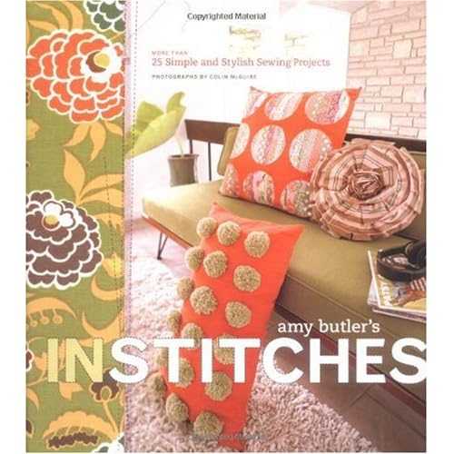
Guess who is hosting the next two challenges at Our Creative Corner - me! It's always so much fun to see what everyone comes up with. For my first week I returned to something near and dear to my heart - an inspiration challenge. I hadn't done one in a very long time, and it really felt good. The inspiration photo is this book cover, and the author is none other than the fabulous fabric maven Amy Butler.


I put one extra little requirement with this challenge - I am asking participants to choose two elements from the inspiration photo to incorporate into their projects and describe what those two elements are. I find it so interesting to see what aspects of the photo grab people - they are never the same!


OK, here is my card. I thought this flower image looked a lot like the fabric shown on the left side of the book cover - it's not SU, it's by Savvy Stamps, but I just had to use it. Everything else is SU, though, and I included some new stuff. Yay for new stuff! Since there was orange in the inspiration photo I pulled out Calypso Coral. I will freely admit that I was not a fan of Cameo Coral - this color is much, much better. I don't know if it'll be my favorite new color, but at least it doesn't hurt my eyes. LOL. The green is another new color, Lucky Limeade. How does this green compare to other greens we've known and loved? Well, imagine if Old Olive and Kiwi Kiss got mixed together - it's very similar to the kiwi but is less yellow, and it's just a touch lighter than the olive. You can't go wrong with this green, I'm thinking! My other colors are So Saffron and Chocolate Chip.

What else is new... oh, the lace ribbon punch! Love, love, love it! I somewhat took my layout from the book cover by putting the embossed panel on the left, but it was better balance to put it in from the edge a little. What do you think of the punched strip on top of the embossing? I've never done it before and I kind of like it! The other new thing is the designer paper, which comes from the Flirtatious specialty paper pack. This is going to be a big seller because it has die-cut doily paper in it. Awesome stuff. The sentiment is from Hodgepodge Happiness - a retiring set, sniff! As a final touch I added just a bit of white 1/8" taffeta ribbon that I colored with the coral marker. We can't get the new In Color ribbon yet (you are going to love it) so I took advantage of supplies I did have and made my own!

OK, so you have your challenge - go stamp something! And make sure you visit the OCC blog to see the rest of the wonderful creations from our fabulous team!

Friday, June 10, 2011

Cherries for Friendship

It's been a while since I had time - or made the time - to create something just for fun. I sent a finished freelance project off yesterday, so I felt like I could take a little break from my crazy life and do a couple challenges. This card is for the colourQ challenge (Cherry Cobbler, Crumb Cake, Early Espresso, Soft Suede, Very Vanilla), the Viva la Verve sketch challenge, and the Pals Paper Arts challenge, which is called What's Your Signature Style? I tend toward clean(er) and simpl(er), sometimes vintage, sometimes cute and sweet... I was tickled that my fellow OCC DT member Wendy Janson commented on my recent baby card being a "Lori card." I guess I do have a typical style and I hope today's card shows it!


This card features a sneak peek stamp set from the new catalog - Cherish Friendship. The images are really sweet and great for coloring - I chose to do some watercoloring for this card. It's always a treat for me to sit down and color - in fact I'm spending all day tomorrow coloring at the Copic certification class in Boston! But I digress... I did my watercoloring with reinkers and a tiny paintbrush. The sentiment is from the same stamp set. At the bottom of the center panel I added two strips of cherry seam binding with crochet trim on top. The eyelet border punch gave me the right look for the bottom trim, and as long as we're doing signature style, I had to put a couple buttons on there. The background DP is retired Soft Suede, and I sponged all the edges with espresso ink to up the vintage factor.

This was fun - I hope it's not several weeks until I get to craft something for fun again! Thanks for visiting and I'll be back tomorrow for the weekly OCC challenge!

Saturday, June 4, 2011

Wedding Doilies

Whew, another week has gone by - we're getting a new roof put on our house so it's been a little crazy around here. I did find a little time for stamping, though - just in time for my preorder from the new catalog to arrive! YAY! I used a few of the new products on my card for this week's challenge at Our Creative Corner. Sharon Wheet is back with a recipe wedding challenge - the ingredients are sheer fabric, pearls, a flower, some kind of trim, and stitching (real or faux).

As I was looking at all the fun new stuff, I picked out three items I thought would work well together for a wedding card: the Delicate Doilies stamp set, the Perfect Pennants die (which has a couple cool doily-type circles) and one of the new In Colors, Pool Party. I *love* this color - it reminds me of Soft Sky, which was one of my absolute favorites. I paired it with black and white for a classic look.

First I embossed black card stock with two of the doily images - they cover the whole panel. The sentiment from Word Play (which I also embossed) fits perfectly in the 1 3/4" circle punch, which also goes nicely inside my white doily die-cut. I added faux stitching around the edge of the circle. My flower was made with the triple flower punch, with pearls for the center. I had to cheat a little on one of the requirements - I only had sheer organza ribbon, no sheer fabric. The color of this ribbon is just a hair lighter than the Pool Party card stock. I wrapped it around the black layer three times for a layered effect, then added white 1/8" taffeta ribbon on top. Three more pearls in the corner finished off my card - and I think I like it!

I know the team will create beautiful wedding projects this week so be sure you visit the OCC blog to check them out. And as always we hope you will play along with us!

Saturday, May 28, 2011

Button Bear

It's time for another challenge at Our Creative Corner! Our hostess for the next two weeks is Sharon Wheet. This week she has a fun one: a baby card using kraft card stock, some kind of trim (ribbon, lace, crochet, etc.) and at least one button. I love making baby cards, so I had a great time with this one!

I used the Nursery Suite designer paper as the inspiration for my colors: Regal Rose, So Saffron, Chocolate Chip (oops, or is it supposed to be Early Espresso?) and white. The basic layout was CASEd from a card I saw in Paper Crafts by Stasia Sloma. I had to use my favorite (retired) bear from Cute & Cuddly, paper pieced of course. The scallop circle stamp comes from the Homemade stamp - I just colored only the outside edge with a marker. The rose scallop border was made with the Tasteful Trim die, and for my trim I added some narrow white lace out of my stash. The buttons dress up the top corner (the flower is SU retired, the others are random ones I found). Last came the sentiment from Something to Celebrate (level 2 hostess set).

OK, now for your daily cuteness quota, go check out the rest of the team's baby cards - they are adorable! And be sure to play with us and share your creation so everyone can see!

Thursday, May 26, 2011

Something new?

Today I'm showing you the technique card we did at my club. I wanted to do an embossing resist technique and I came up with a variation I hadn't seen before - but I don't want to claim that I created something new unless you guys tell me I did! So let me know what you think - is this a new idea, and if by some chance it is, what should I call it? I will say that as I predicted, this card was hard to capture in a photo. IRL it looks really cool, if I do say so myself!

I first took glossy card stock and embossed the foliage image from Fabulous Florets with black craft ink and EP. (Don't forget your embossing buddy!) Next I mixed Poppy Parade reinker with champagne shimmer paint. Using a foam brush, I brushed it over the whole image, then used a paper towel to buff the whole thing. Finally, for more depth of color I brushed another coat of the ink/paint mixture on top and let it dry. I wanted to see the brush strokes - kind of like lacquer, maybe? - so I made sure all the strokes went the same direction and the color was even. With this second coat make sure you don't use too much ink or the brush strokes will disappear as it dries. This will also take a while to dry - in retrospect, probably too long for club unless we had taken the heat gun to it. My gals ended up taking the embossed panel home separately to put the whole thing together later. Once the panel is completely dry, the very final step is to buff it with a clean paper towel, just to make sure no ink is left on the black embossing.

OK, now for the finishing touches - I embossed three flowers with gold EP on black card stock and cut them out. The sentiment from Happy Greetings is also gold embossed. To stick with the gold I used gold card stock as a layer, and two gold brads in each corner give the card just a bit more elegance and shine. Since I featured some brads as my only embellishments, I'm entering this in the Pals Paper Arts brad challenge.

Thanks for stopping by my blog - I hope you'll play around with this technique and tell me what you think. I'd love to see the variations you come up with!

Saturday, May 21, 2011

Father's Day Frame

It's time for another challenge with Our Creative Corner! Where does the time go? This week our hostess, Linda Coughlin, is challenging us to incorporate a 3D frame on our projects. I wasn't sure what I wanted to do, then I saw the Father's Day frame in the summer mini and decided to CASE that idea, but with my own paper frame. We'll be making this at my club this weekend.

To make the frame I cut two 3/4" x 4" strips and two 3/4" x 5" strips from Early Espresso textured card stock. I mitered the corners by trimming off each of the ends and fitting them together - and seeing that it was tricky with paper, I don't think I'll ever be doing it with wood! LOL! It's probably hard to see but I sponged all around the frame and mitered corners to give it more dimension, and the fram is popped up from its background. I made the shirt with Pear Pizazz designer paper and card stock, then added one of the ties from the Best Dad Ever set. This is a big card - 5 x 7 - which it had to be with the size of the frame. The background is simple - white card base, a strip of pear card stock wrapped with baker's twine, and a sentiment from the same stamp set with a row of piercing underneath.

Don't forget to stop by the OCC blog and see what everyone has made for this challenge - and then make your own frame and join us! Thanks for visiting and have a great weekend!

Saturday, May 14, 2011

Natural Elements

For this week's challenge at Our Creative Corner our hostess, Linda Coughlin, has a recipe challenge: use light neutrals as your main color(s), dark neutrals as accent color(s), and both lace AND buttons. I played around with different ideas for a really long time - which is probably not evident by my CAS card. You'll just have to take my word for it! ;)

When I saw the challenge I immediately gravitated toward my favorite neutral color combo: Very Vanilla, River Rock and Basic Black. If lace and buttons were going to be involved that made me think of something pretty and vintage-style, so that led me to Elements of Style. I didn't do anything to the image except sponge the edges with River Rock. The lace was the hardest thing to incorporate - it's not something I'm usually drawn to. I was digging around through boxes of old stuff and nothing was grabbing me, and then I remembered that SU had black lace in the holiday mini last year. Jackpot! After experimenting for a while I ended up just using a couple strips as accents over the streamlined striped background. I also looked and looked for the perfect buttons - these little guys from my stash finally made the cut, and I threaded them with matching embroidery floss. The sentiment didn't come easily, either - I tried lots of punches and nothing looked right, then I realized - duh! - I could just stamp a little sentiment right onto the image. This sweet little saying is from On the Grow (in the summer mini).

I know you will want to visit the OCC blog to see what the rest of the team has come up with - their creations are always fabulous! Then get out your neutrals and play along with the challenge - it's a fun one!